

PLAYBILL Covers of the 2015-2016 Season

GreasedLightning
Broadway Legend Joined: 2/11/14
#1PLAYBILL Covers of the 2015-2016 Season
Posted: 4/21/15 at 1:39am
I am pleased to welcome you all to another year of PLAYBILL covers! Wahoo!
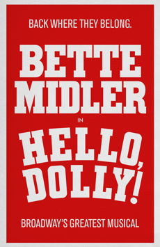
First up: An Act of God!


#2PLAYBILL Covers of the 2015-2016 Season
Posted: 4/21/15 at 3:34am
That's an absolutely hilarious cover! Can't wait to see the marquee. I love how it is in colour!

#2PLAYBILL Covers of the 2015-2016 Season
Posted: 5/29/15 at 2:02pm

"When the audience comes in, it changes the temperature of what you've written." -Stephen Sondheim
ethan231h
Broadway Legend Joined: 5/5/11
#3PLAYBILL Covers of the 2015-2016 Season
Posted: 5/30/15 at 10:07am
Do we know if Playbill is changing their logo for Gay Pride month this June?
Updated On: 5/30/15 at 10:07 AM
loliveve
Broadway Legend Joined: 6/24/12

jacobsnchz14
Broadway Legend Joined: 12/13/06


Fantod
Broadway Legend Joined: 10/3/14
#6PLAYBILL Covers of the 2015-2016 Season
Posted: 6/8/15 at 4:00pm
the Fun Home one doesn't look good at all in Black and White.
#7PLAYBILL Covers of the 2015-2016 Season
Posted: 6/8/15 at 4:03pm
That new "Beautiful" cover is terrible.
bfreak
Broadway Legend Joined: 5/6/11
#8PLAYBILL Covers of the 2015-2016 Season
Posted: 6/8/15 at 4:16pm
Seriously? Fun Home wins Best Musical of the year which will give them a huge boost in sales and then the next day they decide to switch to an awful-looking black and white playbill? That's so stupid and doesn't make any sense.

#9PLAYBILL Covers of the 2015-2016 Season
Posted: 6/8/15 at 4:18pm
The Fun Home is cute in color, but really ugly in black and white! How disappointing.
#10PLAYBILL Covers of the 2015-2016 Season
Posted: 6/8/15 at 4:18pm
"Seriously? Fun Home wins Best Musical of the year which will give them a huge boost in sales and then the next day they decide to switch to an awful-looking black and white playbill? That's so stupid and doesn't make any sense."
Beat me to it! "You just won the Tony what are you going to do next?" "Make my Playbill ugly!"
I like a good rhyme more than a good time
MusicAndPassion
Broadway Star Joined: 9/14/05
#11PLAYBILL Covers of the 2015-2016 Season
Posted: 6/8/15 at 4:39pm
The original article stated these would be released in July.
VintageSnarker
Broadway Legend Joined: 1/30/15
#12PLAYBILL Covers of the 2015-2016 Season
Posted: 6/8/15 at 4:45pm
I don't know what significance the compass has to the show but I continue to find the Amazing Grace cover kind of generic and my brain keeps reading it as Amazing Race.
GreasedLightning
Broadway Legend Joined: 2/11/14
#13PLAYBILL Covers of the 2015-2016 Season
Posted: 6/8/15 at 9:52pm
Playbill covers don't change over night. Any new covers added on PlaybillVault are assumed they will change for the following month.
Disappointed Fun Home is changing to black and white, especially before all their success and packed houses in the next few months and beyond. I am also disappointed that the theater name is changing from just "Circle in the Square" to "Circle in the Square Theatre."
Beautiful has awful artwork in the beginning and their second go around last year was absolutely... beautiful (zinger). Disappointed their third go around is back to... not so beautiful.
loliveve
Broadway Legend Joined: 6/24/12
#14PLAYBILL Covers of the 2015-2016 Season
Posted: 6/17/15 at 9:25pm
Hamilton:

loliveve
Broadway Legend Joined: 6/24/12
#15PLAYBILL Covers of the 2015-2016 Season
Posted: 6/17/15 at 9:27pm
Chicago is getting a new cover with Brandy...

bfreak
Broadway Legend Joined: 5/6/11
#16PLAYBILL Covers of the 2015-2016 Season
Posted: 6/18/15 at 7:56am
I know that was expected to be the Hamilton Playbill, but still its artwork is simply amazing and so interesting. Get used to that artwork because you're going to be seeing it for years (hopefully) like Wicked, The Lion King, and The Book of Mormon.
#17PLAYBILL Covers of the 2015-2016 Season
Posted: 8/6/15 at 4:26pm

"When the audience comes in, it changes the temperature of what you've written." -Stephen Sondheim
rexin
Swing Joined: 5/13/08
#18PLAYBILL Covers of the 2015-2016 Season
Posted: 8/6/15 at 6:36pm
Hamilton looks amazing I might want it on my wall fun home black and white looks like the playbill is sick lol.also the pen and teller looks crisp as hell
GreasedLightning
Broadway Legend Joined: 2/11/14
#19PLAYBILL Covers of the 2015-2016 Season
Posted: 8/6/15 at 6:41pm
This is the nicest black and white Playbill I've seen in a while. Hopefully it looks this good in person.

#20PLAYBILL Covers of the 2015-2016 Season
Posted: 8/6/15 at 6:42pm
I'm glad the Spring Awakening playbill isn't just that horrendous logo they've been using as promotion.

#21PLAYBILL Covers of the 2015-2016 Season
Posted: 8/6/15 at 8:11pm
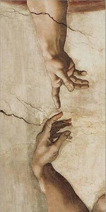
I think it's brilliant the way they've incorporated the ASL theme into the playbill design of Spring Awakening. For those of you who don't know, the arms crossed over the chest is ASL for "love."

#22PLAYBILL Covers of the 2015-2016 Season
Posted: 8/6/15 at 8:38pm
^ I actually didn't know that! Thanks, Internet!
#23PLAYBILL Covers of the 2015-2016 Season
Posted: 8/6/15 at 8:59pm
I am loving the Spring Awakening Playbill cover.
"There’s nothing quite like the power and the passion of Broadway music. "

David2
Understudy Joined: 5/4/13
#24PLAYBILL Covers of the 2015-2016 Season
Posted: 8/6/15 at 9:33pm
The Spring Awakening cover looks really good in black and white. Cannot wait for this production!