

PLAYBILL Covers of the 2017-2018 Season
BroadwayConcierge
Broadway Legend Joined: 7/24/15
#125PLAYBILL Covers of the 2017-2018 Season
Posted: 4/4/18 at 5:36pm
According to Instagram, yes it did. Hmm.
#126PLAYBILL Covers of the 2017-2018 Season
Posted: 4/4/18 at 5:39pm^ Absolutely dreadful. Just like the production itself.
"There’s nothing quite like the power and the passion of Broadway music. "
BroadwayConcierge
Broadway Legend Joined: 7/24/15
#127PLAYBILL Covers of the 2017-2018 Season
Posted: 4/4/18 at 5:40pm
bwayphreak234 said: "^ Absolutely dreadful. Just like the production itself."
I just don't know why they wouldn't use their beautiful key art that's on the marquee and every other promotional material across the city. Seems like a no-brainer to me.
Bwayfan292
Broadway Legend Joined: 6/19/17
#128PLAYBILL Covers of the 2017-2018 Season
Posted: 4/4/18 at 5:41pmYikes. Shoulda just stuck with the rehersal shot.
"Why was my post about my post being deleted, deleted, causing my account to be banned from posting" - The Lion Roars 2k18

jacobsnchz14
Broadway Legend Joined: 12/13/06
#129PLAYBILL Covers of the 2017-2018 Season
Posted: 4/4/18 at 6:10pm
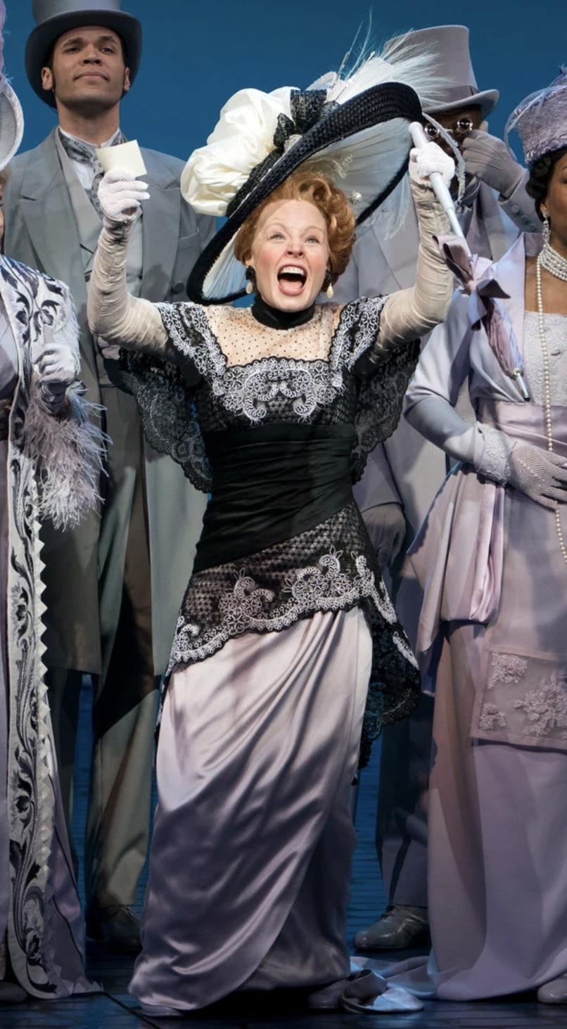
This is not that bad. It's stark and dramatic. I like it. Is it the best? No. But I think it's very sleek.
kade.ivy
Broadway Star Joined: 7/28/13
#130PLAYBILL Covers of the 2017-2018 Season
Posted: 4/4/18 at 6:17pmI really like it...heh. I do wish Jessie was included, but it’s very dramatic and places the focus on Billy.
bwayboy22
Broadway Star Joined: 5/9/12
#131PLAYBILL Covers of the 2017-2018 Season
Posted: 4/4/18 at 6:26pmIt kind of looks like a shot from the revival of Pippin
10086sunset
Broadway Legend Joined: 2/8/16
#132PLAYBILL Covers of the 2017-2018 Season
Posted: 4/4/18 at 7:32pm
Ugh, Carousel.
I didn’t think was was possible to create a second cover that was worse than the first.
Congratulations guys, you found a way.
GeorgeandDot
Broadway Legend Joined: 12/13/16
#133PLAYBILL Covers of the 2017-2018 Season
Posted: 4/4/18 at 7:55pmI actually like the playbill. Mainly because Joshua Henry is such a hunk.
#134PLAYBILL Covers of the 2017-2018 Season
Posted: 4/4/18 at 8:58pm
BroadwayConcierge said: "bwayphreak234 said: "^ Absolutely dreadful. Just like the production itself."
I just don't know why they wouldn't use their beautiful key art that's on the marquee and every other promotional material across the city. Seems like a no-brainer to me."
This is my question. It's some of the nicest key-art of any show currently running on Broadway, and yet they have gone out of their way to not use it on the Playbill. Very strange decision.

#135PLAYBILL Covers of the 2017-2018 Season
Posted: 4/4/18 at 9:03pm
It might be Scott Rudin's hang-up about releasing production shots. I remember how Hello Dolly! they released like a total of 3 or 4 production photos.
As for the playbill I like it. Joshua Henry is really amazing as Billy and that picture captures some of his intensity.
VintageSnarker
Broadway Legend Joined: 1/30/15
#136PLAYBILL Covers of the 2017-2018 Season
Posted: 4/4/18 at 10:11pmGeorgeandDot said: "I actually like the playbill. Mainly because Joshua Henry is such a hunk."
I feel like the new cover emphasizes his skin color (because of the lighting plus the B&W) and his physical build (because of the costume and angle of the photo) which seems to imply that the show is delving into the significance of casting a black man as Billy... which by all accounts, it does not.
SomethingPeculiar
Broadway Legend Joined: 6/15/14
#137PLAYBILL Covers of the 2017-2018 Season
Posted: 4/4/18 at 10:14pm
poisonivy2 said: "It mightbe Scott Rudin's hang-up about releasing production shots. I remember how Hello Dolly! they released like a total of 3 or 4 production photos."
It's definitely a Scott Rudin "thing", but it doesn't seem like there's any rhyme or reason for the productions that have this photo cover + non-logo font. Skylight, View from the Bridge, Humans, Blackbird, Crucible, Front Page, and Glass Menagerie had covers like this. But then Dolly, Doll's House, 1984, and Shuffle Along used their regular color logos.
10086sunset
Broadway Legend Joined: 2/8/16
#138PLAYBILL Covers of the 2017-2018 Season
Posted: 4/4/18 at 10:18pm
If the title of the show was taken off the cover, no one would have any idea which show it was.
I simply think it’s too abstract.
#139PLAYBILL Covers of the 2017-2018 Season
Posted: 4/4/18 at 11:02pm
SomethingPeculiar said: "poisonivy2 said: "It mightbe Scott Rudin's hang-up about releasing production shots. I remember how Hello Dolly! they released like a total of 3 or 4 production photos."
It's definitely a Scott Rudin "thing", but itdoesn't seem like there's any rhyme or reason for the productions that have this photo cover +non-logo font. Skylight, View from the Bridge, Humans, Blackbird, Crucible, Front Page, and Glass Menagerie had covers like this. But then Dolly, Doll's House, 1984, and Shuffle Along used their regular colorlogos."
Book of Mormon also used their regular logo font for the playbill.
#140PLAYBILL Covers of the 2017-2018 Season
Posted: 4/4/18 at 11:24pm
Once On This Island has updated their Playbill to feature the art with Hailey Kilgore:

#141PLAYBILL Covers of the 2017-2018 Season
Posted: 4/5/18 at 5:18pm
msmp said: "BroadwayConcierge said: "bwayphreak234 said: "^ Absolutely dreadful. Just like the production itself."
I just don't know why they wouldn't use their beautiful key art that's on the marquee and every other promotional material across the city. Seems like a no-brainer to me."
This is my question. It's some of the nicest key-art of any show currently running on Broadway, and yet they have gone out of their way to not use it on the Playbill. Very strange decision."
One of the reasons I like the Playbill covers of the and 60's and 70's is because their emphasis was always on the actors and their acting. I love Rudin's retro Playbills because I think it's his attempt at returning us to a time when acting was the priority over marketing. It's a small gesture (as I'm sure most people don't care what Playbills looks like), but I see it as an important one in terms of how theater is viewed.
VintageSnarker
Broadway Legend Joined: 1/30/15
#142PLAYBILL Covers of the 2017-2018 Season
Posted: 4/5/18 at 10:27pmOoh, I want one of those new Once on This Island Playbills.
@z5
Broadway Legend Joined: 11/30/15
#143PLAYBILL Covers of the 2017-2018 Season
Posted: 4/5/18 at 11:12pm
Once on this Island has been that cover for like the past 3 months

#144PLAYBILL Covers of the 2017-2018 Season
Posted: 4/6/18 at 3:15pmI want the new Carousel playbill...anybody have a spare?
#145PLAYBILL Covers of the 2017-2018 Season
Posted: 4/6/18 at 4:08pm
@z5 said: "Once on this Island has been that cover for like the past 3 months"
I know, but no one had shared it here and wanted to make sure that the Playbill fans got to see it.
#146PLAYBILL Covers of the 2017-2018 Season
Posted: 4/13/18 at 10:32am
It looks like Kinky Boots is using a 5th Anniversary Playbill for the entire month of April. I am amazed no one has posted this already.
What was the last production to mark an anniversary or closing with a unique Playbill cover?
=
Not to answer my own question but It looks like its the Phantom 30th this past January which I actually like the cover because its really unique.
and before that it was the Lion King's 20th in November, which simply changed the color of the Playbill logo to from Playbill Yellow to Lion King Yellow, and added a "Celebrating 20 years" tag line.
#147PLAYBILL Covers of the 2017-2018 Season
Posted: 4/13/18 at 6:35pmAnybody have the Head Over Hills Playbill images yet?
Frenchbacon
Understudy Joined: 7/8/17
#148PLAYBILL Covers of the 2017-2018 Season
Posted: 4/14/18 at 8:44pm
BroadwayConcierge said: "bwayphreak234 said: "^ Absolutely dreadful. Just like the production itself."
I just don't know why they wouldn't use their beautiful key art that's on the marquee and every other promotional material across the city. Seems like a no-brainer to me."
I whole-heartedly agree with this. It's better than the rehearsal photo, but I think their WONDERFUL marquee art would look great on a playbill.

#149PLAYBILL Covers of the 2017-2018 Season
Posted: 4/15/18 at 2:23am
Frenchbacon said: "BroadwayConcierge said: "bwayphreak234 said: "^ Absolutely dreadful. Just like the production itself."
I just don't know why they wouldn't use their beautiful key art that's on the marquee and every other promotional material across the city. Seems like a no-brainer to me."
I whole-heartedly agree with this. It's better than the rehearsal photo, but I think their WONDERFUL marquee art would look great on a playbill."
EXACTLY!!! I love the marquee art more than the current Playbill design and I can't see why they are deciding not to put the marquee art on the Playbill.
HELLO PEOPLE! :D
Videos