

PLAYBILL Covers of the 2018-2019 Season
Danielle49
Broadway Star Joined: 10/28/17
#125PLAYBILL Covers of the 2018-2019 Season
Posted: 3/11/19 at 2:06pmWOW. That cover is absolutely stunning. So glad they’re sticking with the initial art.

#126PLAYBILL Covers of the 2018-2019 Season
Posted: 3/11/19 at 2:08pm
WayTooBroadway said: " "
"
YES. YES. YES. Other shows take note, THIS is a playbill cover. Use the artwork!!!
#127PLAYBILL Covers of the 2018-2019 Season
Posted: 3/13/19 at 7:55am
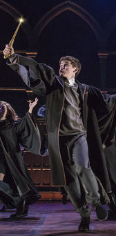
The KING LEAR Playbill cover is just awful.
Updated On: 3/13/19 at 07:55 AM
woeisme3
Featured Actor Joined: 9/14/15
#128PLAYBILL Covers of the 2018-2019 Season
Posted: 3/13/19 at 1:06pmKing Lear’s playbill makes it look like a happy go-lucky romp, lol

#130PLAYBILL Covers of the 2018-2019 Season
Posted: 3/17/19 at 6:25am^ ^ ^ Another NO from me. Just looks cheap and hurried, like they didn’t have any better ideas or put any thought into it.
#131PLAYBILL Covers of the 2018-2019 Season
Posted: 3/17/19 at 7:42amAre these rehearsal playbills seriously becoming a thing? Or just a Scott Rudin thing? Either way, don't care for them. This may be my favorite out of them, but I'd really prefer a production photo or artwork.
#132PLAYBILL Covers of the 2018-2019 Season
Posted: 3/17/19 at 8:06am
Mike Barrett said: "Are these rehearsal playbills seriously becoming a thing? Or just a Scott Rudin thing? Either way, don't care for them. This may be my favorite out of them, but I'd really prefer a production photo or artwork. "
As expensive as it would be to produce, a Playbill detailing a large variety of the campaign badges shown in the marquee, or that of a miniaturized marquee itself with the shape of the star, would have been wonderful.
#133PLAYBILL Covers of the 2018-2019 Season
Posted: 3/28/19 at 7:03pm
By tomorrow night, both Tootsie and Beetlejuice will have started previews. Does anyone have the HD Playbill covers?
Santino posted the Tootsie Playbill on his Instagram: https://www.instagram.com/p/Bvj4ZHLj6ya/
As far as Tootsie goes, it reminds me of the Amelie playbill. I think that is a really pretty color red, but it's definitely a bit too bland for my taste. I wish they used his character headshot they've been using in a majority of the promotional materials for the show.
It's weird how minimalist all the marketing artwork has been for this. It's really contemporary in a not necessarily good way. It's just a bit weird IMO.

#134PLAYBILL Covers of the 2018-2019 Season
Posted: 3/28/19 at 7:45pm
I don't like the Toosite playbill. With all the edits they did with the logo, why wouldn't they just put it on the cover (white text with black background and lipstick dot). They would be so much more iconic.
Miss Keisha? Miss Keisha? Miss Keishhhaaaa?
GeorgeandDot
Broadway Legend Joined: 12/13/16
#135PLAYBILL Covers of the 2018-2019 Season
Posted: 3/28/19 at 7:48pmI love the artwork of Santino shaving in drag. I'm kind of disappointed that they didn't put that on the playbill.
#136PLAYBILL Covers of the 2018-2019 Season
Posted: 3/28/19 at 7:50pm
GeorgeandDot said: "I love the artwork of Santino shaving in drag. I'm kind of disappointed that they didn't put that on the playbill."
I would've loved that as well! That's such a dymanic image. Imagine it changing with every leading actor who takes over that role.. That would've been so cute.
Miss Keisha? Miss Keisha? Miss Keishhhaaaa?
Updated On: 3/28/19 at 07:50 PM
GeorgeandDot
Broadway Legend Joined: 12/13/16
#137PLAYBILL Covers of the 2018-2019 Season
Posted: 3/28/19 at 7:54pmAlso, I heard there's a new King Lear playbill that's a bit more appropriate to the show.
#138PLAYBILL Covers of the 2018-2019 Season
Posted: 3/28/19 at 7:56pmA definitive NO from me on the TOOTSIE Playbill. Reminds me too much of the HELLO, DOLLY! red. They could have used the imagery from the Chicago run or anything else but that. A 5th Grader could’ve done better.
#139PLAYBILL Covers of the 2018-2019 Season
Posted: 3/28/19 at 8:27pm
dmwnc1959 said: "A definitive NO from me on the TOOTSIE Playbill. Reminds me too much of the HELLO, DOLLY! red. They could have used the imagery from the Chicago run or anything else but that. A 5th Grader could’ve done better. "
It does look like Hello Dolly!!!!
Miss Keisha? Miss Keisha? Miss Keishhhaaaa?
#140PLAYBILL Covers of the 2018-2019 Season
Posted: 3/28/19 at 8:31pm
Credit to @bwayemm on Twitter for this BEETLEJUICE Playbill photo:
https://twitter.com/bwayemm/status/1111418604816228353/photo/1
I think I liked DC better. The suit & tie artwork was really cute and gave it a bit more "flair" than just stripes, but it seems as though they've phased that artwork out of all their recent Broadway marketing. I also don't like the extra yellow-space at the top of the Playbill, though I totally see what they were going for. That's just me being picky though, I'm sure lots of thought went into that and it's a pretty cute idea.
#141PLAYBILL Covers of the 2018-2019 Season
Posted: 3/28/19 at 8:31pm
DOUBLE POST
Updated On: 3/28/19 at 08:31 PM
GreasedLightning
Broadway Legend Joined: 2/11/14
#142PLAYBILL Covers of the 2018-2019 Season
Posted: 3/28/19 at 9:13pmIt’s annoying that there’s not three beetles on the cover.
#143PLAYBILL Covers of the 2018-2019 Season
Posted: 3/28/19 at 9:22pm
Another one (Tootsie and now Beetlejuice) where the out of town Playbill was better. However, a tad tighter at the top and a third beetle and that would’ve been much better. Still prefer the suit on the front. :)
VintageSnarker
Broadway Legend Joined: 1/30/15
#144PLAYBILL Covers of the 2018-2019 Season
Posted: 3/29/19 at 1:55pm
Sara and Gavin in Waitress is incredibly charming. I can't wait to see Shoshana and Jeremy. One day I will probably end up buying a lot of all the Waitress Playbills (for the casts I haven't seen in person, I mean). They generally do a great job and I love that they do a special Playbill for the new cast additions.
Kiss Me Kate is disappointing. It's like Roundabout forgets they do B&W Playbills when designing the art sometimes.
Ain't Too Proud is barely trying. I guess it's okay if you get a kick out of fonts.
I get that Oklahoma! is going for something different but the art is very dull. The slight scuffing is barely going to register.
Burn/This is a great glamour shot.
Hadestown is not my favorite image (it reminds me too much of lazy book covers of the school of headless woman and pair of shoes) but I think it's doing what Oklahoma! is trying to do but much better. It's minimal while still making an impression.
Gary is definitely a choice.
I like Hillary and Clinton as a rehearsal shot. At least there's some emotion.
Tootsie has to be a placeholder, right? I guess it makes it easier to read signatures if they anticipate this show being big with the stage door crowd. (The only positive I can think of.)
Beetlejuice is fine. Not unexpected.
VotePeron
Broadway Legend Joined: 5/2/13
#145PLAYBILL Covers of the 2018-2019 Season
Posted: 3/29/19 at 10:51pmNo excuses can be made for that Tootsie playbill design. That is horrific, and such a waste - who is doing marketing for this show?
#146PLAYBILL Covers of the 2018-2019 Season
Posted: 3/29/19 at 11:04pm
VotePeron said: "No excuses can be made for that Tootsie playbill design. That is horrific, and such a waste - who is doing marketing for this show?"
AKA
"Anything you do, let it it come from you--then it will be new."
Sunday in the Park with George
GreasedLightning
Broadway Legend Joined: 2/11/14
#147PLAYBILL Covers of the 2018-2019 Season
Posted: 3/29/19 at 11:12pm
Robbie2 said: "VotePeron said: "No excuses can be made for that Tootsie playbill design. That is horrific, and such a waste - who is doing marketing for this show?"
AKA"
AKA was let go from the project a few months ago.
#148PLAYBILL Covers of the 2018-2019 Season
Posted: 3/29/19 at 11:17pm
GreasedLightning said: "Robbie2 said: "VotePeron said: "No excuses can be made for that Tootsie playbill design. That is horrific, and such a waste - who is doing marketing for this show?"
AKA"
AKA was let go from the projecta few months ago."
Yup ~ SpotCo now is handling marketing for Tootsie
https://www.spotnyc.com/our-clients/
"Anything you do, let it it come from you--then it will be new."
Sunday in the Park with George

#149PLAYBILL Covers of the 2018-2019 Season
Posted: 3/30/19 at 4:06am
Robbie2 said: "Yup ~ SpotCo now is handling marketing for Tootsie"
Good. I hope they can fix it. Or is the removal of the lipstick smudge their only contribution?