

New Next To Normal Artwork?

#1New Next To Normal Artwork?
Posted: 3/1/09 at 4:16pm
I was on telecharge searching for info about Next To Normal and saw this new picture as the artwork. Does anyone know if this is definitely the Artwork they're using for the Broadway Production?
http://www.telecharge.com/BehindTheCurtain.aspx?prodid=7295
#2re: New Next To Normal Artwork?
Posted: 3/1/09 at 4:20pmWow, I hope they use that artwork. It's definitely better than the previous ones they've used.
being.jeremiah
Broadway Legend Joined: 12/23/05
#2re: New Next To Normal Artwork?
Posted: 3/1/09 at 4:22pm
Here's the (rather) new Broadway website:
http://www.nexttonormal.com/

Sondheim_Geek
Broadway Star Joined: 2/20/07
#3re: New Next To Normal Artwork?
Posted: 3/1/09 at 6:32pmI like the new artwork. I can picture on the marquee better than the 2nd Stage 'dangling feet' and the Arena 'face explosion'.
#4re: New Next To Normal Artwork?
Posted: 3/1/09 at 6:34pm
The 2nd Stage artwork always puzzled me. This is a definite improvement.
Any word of a discount code yet?
#5re: New Next To Normal Artwork?
Posted: 3/1/09 at 6:35pm
Oh, wow, I love it!
I missed seeing "Next To Normal" at Arena Stage because I didn't know what it was about until my friend raved over it, and the logo really turned me off. I didn't think I'd like the show just based on the scary logo.
In my pants, she has burst like the music of angels, the light of the sun! --Marius Pantsmercy
KingKong
Broadway Star Joined: 2/28/09
#6re: New Next To Normal Artwork?
Posted: 3/1/09 at 6:41pm
Any word of a discount code yet?
Tickets don't go onsale til tomorrow, and the back row of the mezz is 36 bucks. Its a small theatre a 3 tier set, there won't be bad seats, just save your money and grab a seat in row h.
#7re: New Next To Normal Artwork?
Posted: 3/1/09 at 6:51pmThanks, but I know this show will inevitably have a discount code. I'd rather not sit in the last row, even if it's a small theater.
#8re: New Next To Normal Artwork?
Posted: 3/1/09 at 7:15pmSchmerg, I also HATE the artist that does the Arena Stage programs.
broadwayman17
Broadway Star Joined: 10/27/07
#9re: New Next To Normal Artwork?
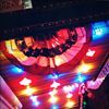
Posted: 3/10/09 at 7:57pm
Second Stage Artwork
http://4.bp.blogspot.com/_hi4TbVj_QiY/SZs2shhI7MI/AAAAAAAAD0E/HsCKedl8m7g/s320/Next+To+Normal.bmp
Arena Artwork 
Broadway Artwork 
Yes, but sometimes people have a third deeper layer thats the same as the first. Like pie. Dr. Horrible
heo1128
Broadway Star Joined: 7/9/08
#10re: New Next To Normal Artwork?
Posted: 3/10/09 at 8:00pmI love the 2nd Stage artwork...however it reminds me of fishing, for some reason haha.

#11re: New Next To Normal Artwork?
Posted: 3/10/09 at 8:42pmOoo I love the new artwork!
"If we don't live happily ever after at least we survive until the end of the week!" -Kermit the frog "I need the money... it costs a lot to look this cheap!" -Dolly P. "Oh please, Over at 'Gypsy' Patti LuPone hasn't even alienated her first daughter yet!" Mary Testa in "Xanadu" "...Like a drunk Chita Rivera!" Robin de Jesus in "In the Heights"
"B*tch, I don't know your life." -Xanadu After that if he still doesn't understand why you were uncomfortable and are now infuriated, kick him again but this time with Jazz Hands!!! -KillerTofu
#12re: New Next To Normal Artwork?
Posted: 3/10/09 at 9:39pmI think it looks like a poster for a horror movie about a vengeful piano teacher.
"...everyone finally shut up, and the audience could enjoy the beginning of the Anatevka Pogram in peace."
KingKong
Broadway Star Joined: 2/28/09
#13re: New Next To Normal Artwork?
Posted: 3/10/09 at 9:48pmAnd yet its still more relevant to the story than that dreadful Second Stage art with the family (with two young children) hanging their feet of the end of a dock.
#14re: New Next To Normal Artwork?
Posted: 3/10/09 at 10:20pmI love the eyes, coloring and the house. Not so much the notes and the tagline. But it's definitely better than the previous ones.
#15re: New Next To Normal Artwork?
Posted: 3/11/09 at 3:21am
I do like the new artwork and think the new tagline is original.
But, brandonm2, where can we see a bigger version of your avatar? That looks like a great promo shot!
jordangirl
Broadway Legend Joined: 10/1/06
#16re: New Next To Normal Artwork?
Posted: 3/11/09 at 7:21am
I first saw it on the Arena Stage blog.
Experience live theater. Experience paintings. Experience books. Live, look and listen like artists! ~ imaginethis
LIVE THAT LESSON!!!!!!
LIVE THAT LESSON!!!!!!
#17re: New Next To Normal Artwork?
Posted: 3/11/09 at 7:22amThanks, jordangirl. That's a nice picture
PiraguaGuy2
Broadway Legend Joined: 10/10/08
#18re: New Next To Normal Artwork?
Posted: 3/11/09 at 7:29amAm I the only one who likes the Arena Stage artwork?
Formerly SirNotAppearing - Joined 3/08
KingKong
Broadway Star Joined: 2/28/09
#19re: New Next To Normal Artwork?
Posted: 3/11/09 at 7:43amI didn't hate it, but it did kind of have a nightmare inducing quality.
Craww
Broadway Legend Joined: 12/13/06
#20re: New Next To Normal Artwork?
Posted: 3/11/09 at 10:58am
I think they have a really poor idea of how to market this show visually.
The newest artwork might be my least favorite. They actually finally land on the right concept, kind of, and blow it with flat/boring/amateur execution. Especially the cheap-Photoshop-brush effect of the music bar.

#21re: New Next To Normal Artwork?
Posted: 3/11/09 at 11:07amIt makes me think of Rosemary's Baby for some reason.
#22re: New Next To Normal Artwork?
Posted: 3/11/09 at 11:15amI really like the new artwork! Actually I liked the arena artwork as well - though it always made me think "dark comedy" for some reason. The new art is very Hitchcockian which I think fits oddly enough...
#23re: New Next To Normal Artwork?
Posted: 3/11/09 at 11:57am
"Am I the only one who likes the Arena Stage artwork?"
No, I like it, too. I think it's probably the strongest of three designs.
I really don't like the Broadway artwork. I think it looks a little amateurish and is incredibly vague. For a show that will almost certainly be fighting an uphill battle for financial success, I would think they would be able to find a better way to draw people in.
Face it- if you had no idea what Next to Normal was, would that poster draw you in? Or would you get distracted by a shinier poster?
"...everyone finally shut up, and the audience could enjoy the beginning of the Anatevka Pogram in peace."
#24re: New Next To Normal Artwork?
Posted: 3/11/09 at 12:05pmI prefer the Broadway artwork I guess, though it's pretty obvious whoever designed it doesn't know a thing about music. It's a rather lazy attempt. I just hope they have a new set design. It's the one thing I truly detested about the show.
"What can you expect from a bunch of seitan worshippers?" - Reginald Tresilian