

Ugliest Broadway posters
After Eight
Broadway Legend Joined: 6/5/09
#50Ugliest broadway posters
Posted: 1/4/15 at 9:51am
"The point is that the poster doesn't have a REASON for his dislike."
One doesn't have to give a reason.
"This being a DISCUSSION board makes an explanation important. It is immature to say, "just because", so therefore age IS A FACTOR. "
The posters who cited Soon, Rachel Lily Rosenbloom, Footloose, Carrie, and others gave no reasons. Does that make them them equally "immature?"
And age is not a factor. There are 30 somethings here who were biting their nails over the outcome of the Tony Awards, who shriek/cry hysterically at nonsense, and who use words such as "fav." Not to mention the eminent elder statespeople here who regularly use the sn*ing gutter language of junior high school students in their everyday discourse and in their lame and embarrassing attempts at "bon mots."
Kindergarteners display greater maturity.
#51Ugliest broadway posters
Posted: 1/4/15 at 10:27amMr. Novak and Aftereight, you are delirious. As a teacher of sixteen year olds, the have very little to add to any intelligent conversation. Sorry. Not meant as a slur. They will mature and gain some depth, insight, and an appreciation of what came before them. However, that could be wishful thinking.

#52Ugliest broadway posters
Posted: 1/4/15 at 12:10pmAlway nice to see an educator who has open contempt for his/her students. I feel sorry for the kids you "teach"... for many reasons.
After Eight
Broadway Legend Joined: 6/5/09
#53Ugliest broadway posters
Posted: 1/4/15 at 12:14pm
"the have very little to add to any intelligent conversation. "
Nonsense.
Perhaps if you prompted an intelligent conversation, they would have a great deal to add to it.

#54Ugliest broadway posters
Posted: 1/4/15 at 1:02pm

I have never been a fan of the Assassins revival poster. I think it's a totally fangless and poor representation of the show with a terribly literal design concept. And I know those colors were used heavily in the show's lighting design, but here they don't inform you much of what the show is.
"...everyone finally shut up, and the audience could enjoy the beginning of the Anatevka Pogram in peace."

#55Ugliest broadway posters
Posted: 1/4/15 at 1:05pm^ I agree with everything you said.
"There’s nothing quite like the power and the passion of Broadway music. "
#56Ugliest broadway posters
Posted: 1/4/15 at 2:26pm
Delirious for not mindlessly discriminating based on age?? I may be delirious but it's better than overwhelmingly cynical and pretentious.
And the fact is these posters are art, no matter how you feel about them, and a person may not know why a piece of art just seems hideous or gorgeous to them.
Keeping BroadwayWorld Illustrated
Fantod
Broadway Legend Joined: 10/3/14
#57Ugliest broadway posters
Posted: 1/4/15 at 3:20pm
I don't understand why everyone keeps calling me immature just because I don't like a freaking poster. If you want a reason, it is because I don't like it. Specifically, I hate the orange color, which looks cheap, the font, which looks distorted, and the tearing of the photo, because it's gimmicky. But I'm sure you'll just say that those aren't actual reasons and that once I mature I'll realize that the poster is beautiful.
And JayG 2, I'm counting my blessings that I don't have you as a teacher.

#58Ugliest broadway posters
Posted: 1/4/15 at 3:23pm
The original poster for Jane Eyre was hideous.
If I recall correctly, it was a terrible drawing of her reading under a tree.
I saw it once in the times before it opened and never again.
The final poster art was much better.
I recall the curtain changed as well in previews.
#59Ugliest broadway posters
Posted: 1/4/15 at 10:35pm
The initial artwork they released for the upcoming revival of On the 20th Century was pretty inadequate...to say the least.
And the description of that Desire Under the Elms poster as "a final project for a Photoshop class" was spot on!
http://puccinischronicles.wordpress.com

#60Ugliest broadway posters
Posted: 1/5/15 at 2:03am
Re: Gentleman's Guide:
"Its orange & gave me the impression that the show would suck... and it did."
If a poster gives you the impression that you won't like the show, and you then don't like the show, wouldn't that mean it was an effective poster?!
#61Ugliest broadway posters
Posted: 1/5/15 at 9:47am
It's sad that none of you have me as a teacher. My students love me; they enjoy coming to my classes. I have constantly been told that my classes are their favorites and have always been one of the most popular teachers in my school. Why? Because I don't tell them everything they **** is a work of art. Self esteem is not a given. It is something a person has to earn. They earn it in my classroom, and when they get that rare A or a B, it actually means something. So wise up, kiddies, and understand that at sixteen you have learned very little about ANYTHING. You have a long way to go. Remember a comment like "Nice job" or "That's interesting" is really saying "What nonsense. But I don't want to hurt your feelings." Remember that next time you sit in your classrooms feeling superior.
Now for my next lesson...
Fantod
Broadway Legend Joined: 10/3/14
#62Ugliest broadway posters
Posted: 1/5/15 at 10:04amThe majority of your class gets C's????? And I'm not superior, I'm just glad that my teachers actually are interested in hearing what their students have to say instead of just telling their kids to blindly accept what their teachers say. For example, we learned about Henry David Thoreau this most recent semester, and for my final on the subject I wrote about how Transcendentalism is detrimental to our society and received a pretty good grade on it, despite it conflicting with the teacher's viewpoints because it was reasonably well put together and thought out. Now, here on this website, I am under no obligation to give a research paper on each of my opinions, but the fact still remains that I am capable of having my own thoughts and don't have to copy how others feel. If you just tell kids what to think, how will they ever find their own thoughts? I don't claim my opinions are better than others', just that they should be equally valued. So, I will repeat, I am very glad that you are not my teacher because I cannot imagine how stressful it must be to be in a classroom where varying opinions are not accepted, because then I could never learn to say what I actually meant. Have you ever heard the song "The Company Way" from How to Succeed? Well that is exactly the philosophy you are teaching. Because we are young, we have absolutely nothing smart to say so we must never learn to speak for ourselves until what we have to say is exactly like everyone else.
Fantod
Broadway Legend Joined: 10/3/14
#63Ugliest broadway posters
Posted: 1/5/15 at 10:20amAlso, I didn't realize that the American public (or private) eduction system was a popularity contest for students to get to like you the best. I can't get over how angry your post makes me. How can you spend hours every day with adolescent minds and still think they have nothing interesting to say!? And I think you're mistaking self-esteem for ego, as self-esteem, as about every child psychologist will tell you (read a book on the subject), is an extremely important factor in emotional development for kids, so I hope beyond hope that you don't spend your days crushing your students' self-esteem. There are literally hundreds of great works published by some of the greatest minds in history about the dangers of constricted thought. The Catcher in the Rye alone is an extremely moving testament to the true emotional complexity and maturity of a 15 year old and talks about free thought. Hemingway, Kerouac, etc. or do you think that those authors are equally stupid?
After Eight
Broadway Legend Joined: 6/5/09
#64Ugliest broadway posters
Posted: 1/5/15 at 10:41am
"I have constantly been told that my classes are their favorites and have always been one of the most popular teachers in my school."
Are they going to tell you you're their worst teacher? And what do you think they are telling their other teachers?
"Why?"
Perhaps to suck up to you?
Our school systems are shortchanging our young people badly.
Teachers with attitudes like yours are part of the problem.

#65Ugliest broadway posters
Posted: 1/5/15 at 1:31pm

uhhhh….yeah no. I think they are trying to replicate a Lichenstein look used in the film credits

#66Ugliest broadway posters
Posted: 1/5/15 at 2:40pmThe Carrie and Sunday in the Park windowcards are both conceptually fantastic.
#67Ugliest broadway posters
Posted: 1/5/15 at 2:45pmAgreed on the Assassins poster. Incredibly timid and lame.
Liza's Headband
Broadway Legend Joined: 5/28/13
#68Ugliest broadway posters
Posted: 1/5/15 at 3:19pmFantod. It is not your opinion that rubbed posters the wrong way. It is the fact that you did nothing to back it up with a substantive argument (until later pushed to do so).

#69Ugliest broadway posters
Posted: 1/5/15 at 6:26pm
Maltby and Shire need new art designers.


....but the world goes 'round
Green_Flash
Understudy Joined: 4/5/13
#70Ugliest broadway posters
Posted: 1/5/15 at 7:01pm

Even though I loved the show, HANDS ON A HARDBODY had a difficult one to do.

#71Ugliest broadway posters
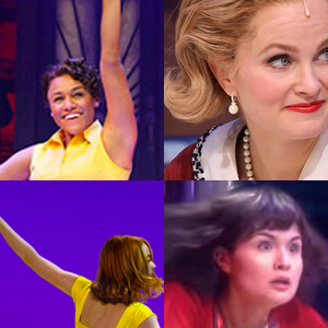
Posted: 1/5/15 at 8:09pm
This may be a stupid question, but what exactly do the white lines on the Carrie image represent? Are the sideways parentheses on top of each other supposed to represent her eye, with the red drop representing a tear? And is the vertical white line supposed to be the side of her face? I assume the red wavy lines are her hair.
Sometimes I wonder if the vertical white line is the shoulder and the sideways parentheses are the neck, but then the red drop would then be blood dripping from her neck, which doesn't seem to follow.
Sorry to ask a dumb question, and please don't flame me! It's such an interesting image, but I just wish I understood it!
"What was the name of that cheese that I like?"
"you can't run away forever...but there's nothing wrong with getting a good head start"
"well I hope and I pray, that maybe someday, you'll walk in the room with my heart"

#72Ugliest broadway posters
Posted: 1/6/15 at 1:08am
Pray tell: WHAT is wrong with the Sunday in the Park with George poster? I've always loved it.
Nothing. It is a brilliant distillation of the show's two acts set a century apart and ties in a hint of the Seurat painting that inspired it. I think a good show card looks god full sized in color and shrunk down to 1/8 of a page in the N Y Times and in either format plants a seed of intrigue in the viewer's mind.
BTW if you think the poster for FOOTLOOSE looks hideous you should have seen what they did to the exterior of the Richard Rodgers theatre.
Cast albums are NOT "soundtracks."
Live theatre does not use a "soundtrack." If it did, it wouldn't be live theatre!
I host a weekly one-hour radio program featuring cast album selections as well as songs by cabaret, jazz and theatre artists. The program, FRONT ROW CENTRE is heard Sundays 9 to 10 am and also Saturdays from 8 to 9 am (eastern times) on www.proudfm.com

Rumpelstiltskin
Broadway Star Joined: 4/22/07
#73Ugliest broadway posters
Posted: 1/7/15 at 9:50am
For years I thought the Song and Dance poster was hideous before a friend pointed out that I wasn't seeing what the artist intended.
Here's the Playbill cover with the same design. Do you see an attractive woman with hair flowing on both sides of her face, or the woman's profile I had been seeing with Richard Nixon jowls, a hump on her forehead, pointy nose, and double chin?
I speak from experience when I say that it's hard to see one if you've only been seeing the other. I colored in each woman's hair in the drawings on the right to highlight the difference.

(In a related note, I thought this thread was about the ugliest people posting on the message board.)

#74Ugliest broadway posters
Posted: 1/7/15 at 10:55am
(In a related note, I thought this thread was about the ugliest people posting on the message board.)
No that thread would be titled: Ugliest BroadwayWorld.com posters.