

Favorite Set Designs
#450re: Favorite Set Designs
Posted: 6/1/11 at 9:17pm
ericmontreal, Really fun idea to compare the two Ragtimes. I thought Derek McLane did a beautiful job with the unit set for the revival, which obviously had major budgetary limitations. Beautiful sense of poetry created out of a rhythm of stairways, galleries, victorian brackets and arches alone. Loved the skeletal furniture or car pieces. And the transformation into the Morgan Library was stunning.
But my heart belongs to daddy Eugene, I gotta say. All those photo pieces of the New Rochelle house or the lighthouse on the beach in Atlantic City gave me an emotional connection to the stage pictures that was lacking in the revival. I wish Lee had made more of his stereopticon idea (there was an oversized viewer mounted atop the proscenium). Oh, and McLane's rightfully praised cloud backdrop? It was really a respectful nod to Lee's original series of stunning cloud backings of 11 years earlier. Of course it could be that I was so in love with the original production in a year in which it got so little love compared to the Lion King juggernaut. So I admit to not being objective about this. (Sorry, Derek.)
Updated On: 6/1/11 at 09:17 PM
Leading Actor Joined: 12/31/69
#451re: Favorite Set Designs
Posted: 6/1/11 at 10:53pm
"ericmontreal, I agree that Eugene Lee's "Showboat" had spectacular design ideas at work (the radically ungingerbreaded showboat units were so superb) but also clunky ones too-- remember the heavy lumpen Palmer House Hotel set in Act II? "
LOL actually, no I don't. And my souvenir programs for most of the shows I saw back then in Vancouver like it and Ragtime are boxed away--though now I'm curious to look.
I haven't seen the Ragtime revival live--whereas I saw Ragtime four times in Vancouver (I was a bit obsessed, and though we had the second cast--shared with LA--it was a big deal at the time to have such a major show playing where I lived, initially before it even had formally opened in New York--plus I loved it). I don't always like the use of photography in backdrops, etc, but I did iin this. You're right though, they only used the stereoscope (or whatever it's called) in the opening, which for such a major opening visual metaphor could be seen a waste. I know some complained about the typical Livent over the top opulence--real cars, etc, but the only time I remember thinking it was a bit much was the transition into the library--a transition I think I read was vastly downgraded for the later tour.
But I thought i was not only often breathtakingly designed, it also was very effective (things like the gates coming down for the immigrants, moving from busy sets to ones largely dominated by clouds as you mentioned, etc). I really must pull out those programs.
#452re: Favorite Set Designs
Posted: 6/1/11 at 11:32pm
eric, God I love this thread.
It's so much fun to reach back into the mists of memory to list the visuals that stay with us from all those years ago. (My advantage is I started out as a set designer, so was obsessed with the design choices in every show I saw.) I still find that if a show is ok but the set is great, I count the night a success. But if a play is great and the set sucks (no names here), then it's really tough to give the play much love.
Leading Actor Joined: 12/31/69
#453re: Favorite Set Designs
Posted: 6/2/11 at 12:47am
I came to theatre from a dance background/obsession, and actually only really paying attention to sets (at least by designer name) is a relatively new thing, but I know what you mean. (And I wish there were more books of designs like the Frank Rich Aronson book--nothing's more frustrating to me than when you get a book about a musical, even the souvenir program and there are no clear shots of the sets). Btu what you say makes a lot of sense.
Anything to avoid the increasingly lazy trend of overusing
harvill
Swing Joined: 7/10/11
#454re: Favorite Set Designs
Posted: 7/10/11 at 10:58pm
just adding my list of faves
from my own personal theatregoing.....
on Broadway
Ballroom
Carousel-Lincoln Center Revival
Follies-original
Hello, Dolly!
My One and Only-beautifully understated in bright primary colors
Nine-original
No No Nanette-Revival
On the Twentieth Century
Sunday in the Park with George-original
from seeing color full stage photograghs
Do I Hear a Waltz?
Flower Drum Song
King and I
Li'l Abner
Oklahoma!
On the Town
Porgy and Bess
favorite individual sets
the Loveland set for Follies
the Harmonia Gardens set for Hello, Dolly!
the main set for Nine
the First and Third act sets for No No Nanette
the First act finale set of Sunday in the Park with George
the backdrops for thr original Oklahoma
the Imaginary Coney Island Ballet set for On the Town
other favorites are
the Second act finale set for Kiss Me Kate
the dream sequence sets for Lady in the Dark
the Second act set for A Day in Hollywood/A Night in the Ukraine
the worst set i ever saw was the summer stock tour of Hello, Dolly! at TOTS in Atlanta Georgia starring Betty Grable
up through the first scene of act 2, the Oliver Smith original designs were being used, but when the Harmonia Gardens restaurant scene appeared, they had replaced the Victorian red restaurant with a CHARTREUSE garden set with gilded bird cages for the booths-the waiters had bright green jackets on, but when Dolly Levi made her entrance she was still in the original RED dress-the audience gasped-it looked like Christmas in the Sebatien Venable's Garden-stupid and terrible
i think my least favorite set currently was the Nine revival with that little creek running through the stage-and all those actresses in all those gowns and heels had to lift their dresses up and tiptoe through the water, and then finally poor Chita Rivera was perched precariously on top of that round table turned on its side!!! in heels!!! with water flowing all around!!! and one lone candlelabra being held up by some undersized ensemble member-did no one see the original production!!!?????
i'm very tired of monochrome empty stages and slideshows....sorry....projections
i love set designs, and i love stylization and big artificial garishly colored sets
now every Broadway show looks like Memphis!....even Spiderman is dreary
harvill
Swing Joined: 7/10/11
#455re: Favorite Set Designs
Posted: 7/10/11 at 11:00pm
just adding my list of faves
from my own personal theatregoing.....
on Broadway
Ballroom
Carousel-Lincoln Center Revival
Follies-original
Hello, Dolly!
My One and Only-beautifully understated in bright primary colors
Nine-original
No No Nanette-Revival
On the Twentieth Century
Sunday in the Park with George-original
from seeing color full stage photograghs
Do I Hear a Waltz?
Flower Drum Song
King and I
Li'l Abner
Oklahoma!
On the Town
Porgy and Bess
favorite individual sets
the Loveland set for Follies
the Harmonia Gardens set for Hello, Dolly!
the main set for Nine
the First and Third act sets for No No Nanette
the First act finale set of Sunday in the Park with George
the backdrops for thr original Oklahoma
the Imaginary Coney Island Ballet set for On the Town
other favorites are
the Second act finale set for Kiss Me Kate
the dream sequence sets for Lady in the Dark
the Second act set for A Day in Hollywood/A Night in the Ukraine
the worst set i ever saw was the summer stock tour of Hello, Dolly! at TOTS in Atlanta Georgia starring Betty Grable
up through the first scene of act 2, the Oliver Smith original designs were being used, but when the Harmonia Gardens restaurant scene appeared, they had replaced the Victorian red restaurant with a CHARTREUSE garden set with gilded bird cages for the booths-the waiters had bright green jackets on, but when Dolly Levi made her entrance she was still in the original RED dress-the audience gasped-it looked like Christmas in the Sebatien Venable's Garden-stupid and terrible
i think my least favorite set currently was the Nine revival with that little creek running through the stage-and all those actresses in all those gowns and heels had to lift their dresses up and tiptoe through the water, and then finally poor Chita Rivera was perched precariously on top of that round table turned on its side!!! in heels!!! with water flowing all around!!! and one lone candlelabra being held up by some undersized ensemble member-did no one see the original production!!!?????
i'm very tired of monochrome empty stages and slideshows....sorry....projections
i love set designs, and i love stylization and big artificial garishly colored sets
now every Broadway show looks like Memphis!....even Spiderman is dreary
#456re: Favorite Set Designs
Posted: 7/11/11 at 1:41am
harvill, I gotta say I agree with a few of your favorites but I strongly disagree on your take of the original set for Nine vs the design for the 2003 Revival.
I found the 1982 set boring and utterly without soul for a show that's all about obsession and passion. White 6" square fake tiles as far as the eye could see. Couldn't figure out what Fellini had to do with a sterile hospital room.
By comparison, the first time I left the theater dazzled by a Scott Pask design was for the revival. I LOVED the decaying walls covered in a renaissance fresco of a beautiful woman, with the water cascading down like Venice in aqua-alta season. The fact that those fabulous ladies in their stunning gowns had to deal with rising water throughout the evening was involving and visceral and brought to life a dreamstate that perfectly matched Fellini. Can't wait for Pask to surprise me once again with a design so full of magic.

#457re: Favorite Set Designs
Posted: 7/11/11 at 5:55am
From GYPSY (1959 production): the railroad station scene at the end of Act One, when "Everything's Coming Up Roses" is sung. The perspective was painted to infinity, doubling the effect with the tracks below and the wires above, all gradually disappearing into infinity, perhaps symbolizing the loss of June and the boys in the act as they go out on their own. The designer was Jo Mielziner, considered by some to be the most highly acclaimed scenic and lighting designer of the American theatre of the 20th Century, spanning five decades. A biography titled "Mielziner: Master of Modern Stage Design" by Mary C. Henderson, is well written and interesting, and contains photographs in color of sets from all of his shows.
The unit set for the original Broadway production of OLIVER by British designer Sean Kenny was innovative for its time. It was mounted on a large turntable which allowed scene changes to take place instantly and also allowed chases to take place through the London Streets as the turntable rotated.
The set for CARNIVAL was magical. When one entered the theatre about 15 minutes before the action started, the curtain was already up and the lighting subdued. Very gradually the lighting intensity increased while ?ome of the actors (roustabouts) began setting up the carnival from scratch, slowly adding this and that until a full fledged carnival came into view. I don't recall the designer, but the genius behind this production was director/choreographer Gower Champion.
"Madam Rose...and her daughter...Gypsy!"
Updated On: 7/11/11 at 05:55 AM
#458re: Favorite Set Designs
Posted: 8/4/11 at 8:38amDoes anyone have any pictures of the set for the 1992 revival of Guys And Dolls?
''With the number of people I ignore, I'm lucky I work at all in this town'' - Helena Bonham Carter
#459re: Favorite Set Designs
Posted: 8/4/11 at 3:26pm
sorry, Jamie, no pictures to offer of Tony Walton's amazing designs for the '92 Guys & Dolls. But those sets are all showstoppers.
But just saw Tony in LA 4 days ago, where the Art Directors Guild was having a screening and Q&A of his gorgeous film The Boyfriend. Tony shared stories on many of his greatest projects, including how the designs for "Pippin" came into being.
Turns out in designing the costumes, Pat Zipprodt had laid in the pencil drawings, the skin tones, and a few spots of color on an otherwise white field, and hadn't ever filled in the rest of the color. Tony loved the white look of the unfinished sketches so Pat sold that idea to Bob Fosse for the finished clothes.
On the scenery end, Tony had designed a spectacular look for each set involving giant multi-colored handkerchiefs stitched together and edged in gold rope, stemming from the magician's trick of chains of handkerchiefs that starts the show. (Charlemagne's Tent still embodies that look.) Fosse was only half-enthusiastic, till he asked: what would happen if we took away all the handkerchiefs? What remained were the brilliant Tony-winning skeletal rope designs we've all admired ever since.
#460re: Favorite Set Designs
Posted: 8/4/11 at 3:49pm
A small additional detail to that story:
She was actually running late to the meeting and did most of that watercolour work while in the cab en route to Fosse's office.
If we can go beyond Broadway for a list of favourite set designs, Michael Levine's amazing set for the Paris Opera's RUSALKA. It took me a while to warm up to Levine, but this one pretty well sealed the deal.
Ezio Frigerio's wonderfully excessive FRANCSCA DA RIMINI for the Met Opera. You thought Zefferelli went big? Check this monster out.
San Francisco Opera's *incredible* MEPHISTOPHELES, with the wind up garden in Act Two. I dont remeber who designed it, but the whole production was stunning from beginning to end.
Everyone's already listed my NY favourites, but I'll add one more: the recent revival of FIDDLER. It was utterly charming.
http://docandraider.com
#461re: Favorite Set Designs
Posted: 8/8/11 at 6:15am
Found these few photos on the web (keep in mind, they look MUCH better lit)
Wizard Of Oz @ London Palladium


Sorry theyre so big. I wasn't able to downsize them
''With the number of people I ignore, I'm lucky I work at all in this town'' - Helena Bonham Carter
#462re: Favorite Set Designs
Posted: 8/8/11 at 6:15am
Found these few photos on the web (keep in mind, they look MUCH better lit)
Wizard Of Oz @ London Palladium
Sorry theyre so big. I wasn't able to downsize them
''With the number of people I ignore, I'm lucky I work at all in this town'' - Helena Bonham Carter
#463re: Favorite Set Designs
Posted: 8/21/11 at 11:44amThis might be somewhat off topic but I have a question about the set design for Sister Act on Broadway. The large set piece which makes the police station, eddies bedroom etc changes alot throughout the show. Do they change the sides of the set peice each time it needs to change or do they just attach different set pieces. I believe "Rabbit Hole" used a similar design. If anyone can explain the process a little better than I just attempted, feel free!
''With the number of people I ignore, I'm lucky I work at all in this town'' - Helena Bonham Carter
Wilmingtom
Broadway Legend Joined: 7/18/11
#464re: Favorite Set Designs
Posted: 8/21/11 at 11:57amBob Crowley's set for CAPEMAN was astounding!

#465re: Favorite Set Designs
Posted: 11/25/11 at 8:51pm
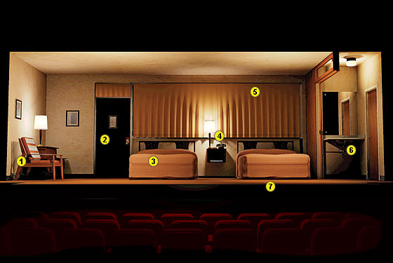
John Lee Beatty's design for Other Desert Cities was very striking, it reminded me heavily of my grandparents' house in Palm Springs, especially at "sundown" at the end of the first act. (I believe this is off-broadway, because the drink cart isn't stationary against the stage left wall, the floor-to-ceiling glass windows down left and right are nowhere to be found, and an extra chez lounge is pictured in the foreground, where it has been replaced by an ottoman.)

#466re: Favorite Set Designs
Posted: 12/11/11 at 2:34am
God how I LOVE this thread.
Current Follies revival designed by Derek McLane


#467re: Favorite Set Designs
Posted: 12/14/11 at 5:46pmDoes anyone have any pictures of the set for the original Broadway production of Disney's Beauty and the Beast?
''With the number of people I ignore, I'm lucky I work at all in this town'' - Helena Bonham Carter
broadwayguy2
Broadway Legend Joined: 5/18/03
#468re: Favorite Set Designs
Posted: 12/14/11 at 5:56pm
http://www.stanleyameyerdesign.com/
Stan Meyer's website, with his Beauty and the Beast designs..
#469re: Favorite Set Designs
Posted: 1/22/12 at 4:55pmDoes anyone have any pictures of the original SIDE SHOW set?
''With the number of people I ignore, I'm lucky I work at all in this town'' - Helena Bonham Carter
sfs1414
Featured Actor Joined: 8/3/04
#470re: Favorite Set Designs
Posted: 1/23/12 at 2:34amDid anyone else see the Mountain Top? What an amazingly detailed set... then when it "exploded" at the end....Jaw dropping.
RippedMan
Broadway Legend Joined: 8/14/05
#471re: Favorite Set Designs
Posted: 1/23/12 at 3:11pmWait. It explodes? Ugh I wish I had seen that show!
morosco
Broadway Legend Joined: 7/10/04
#472re: Favorite Set Designs
Posted: 1/23/12 at 3:37pm
Here's an interesting article on the set for The Mountaintop.
In Search of Lost Time
AwesomeDanny
Broadway Legend Joined: 7/30/09
#473re: Favorite Set Designs
Posted: 1/23/12 at 4:25pm
Broadway.com did a nice feature of the set
http://www.broadway.com/shows/mountaintop/videos/
sfs1414
Featured Actor Joined: 8/3/04
#474re: Favorite Set Designs
Posted: 1/23/12 at 4:29pmI don't know if "explodes" is the right word but it's kind of what it reminded me of. It all happened so quickly. The walls spin and went off into the wings the ceiling flew out so fast and the floor including the beds and everything moved backwards and became a wall that images were projected onto. It was so unbelievable to watch because it all happened so quickly. The room was there and then in a blink of an eye it was gone.