

MARY POPPINS Broadway Artwork Revealed...
bwayondabrain
Broadway Legend Joined: 5/20/05
#50re: MARY POPPINS Broadway Artwork Revealed...
Posted: 2/5/06 at 10:54am
yeah, i know! i just really liked the second london logo!
yeah...
#51re: MARY POPPINS Broadway Artwork Revealed...
Posted: 2/5/06 at 1:39pmActually, I'm most worried that "Being Mrs. Banks" and "Brimstone and Treacle" will be cut. I actually didn't care for the toyroom song, although it is very well staged.
BwayBaby18
Broadway Legend Joined: 2/19/05
#52re: MARY POPPINS Broadway Artwork Revealed...
Posted: 2/6/06 at 3:59pmWay to dumb things down for Americans Disney!
DAME
Broadway Legend Joined: 4/15/04
#53re: MARY POPPINS Broadway Artwork Revealed...
Posted: 2/6/06 at 4:05pmTACKY! Looks like they are promoting a Mary Poppins Disney on Ice show. TACKY.
HUSSY POWER!
------ HUSSY POWER!
pattifan2
Broadway Legend Joined: 7/12/04
#54re: MARY POPPINS Broadway Artwork Revealed...
Posted: 2/6/06 at 4:49pmCouldn't agree more, Dame. The original London artwork had a certain whimsical feel and was so very English with the blossoms and Cherry Tree Lane and the house front etc. When that image was projected onto the front screen in the theatre, it really set the scene. It just feels like they took more than a spoonful of sugar out of it.
...fragment of the day...
Updated On: 2/6/06 at 04:49 PM
popcultureboy
Broadway Legend Joined: 7/23/03
#55re: MARY POPPINS Broadway Artwork Revealed...
Posted: 2/6/06 at 4:52pmWhat neddyfrank posted are the OLD London logos. OLD. The new London logo is the one that is being used for the show on Broadway. I already said this earlier in the thread. So I'll say it again now.
Nothing precious, plain to see, don't make a fuss over me. Not loud, not soft, but somewhere inbetween. Say sorry, just let it be the word you mean.
#56re: MARY POPPINS Broadway Artwork Revealed...
Posted: 2/6/06 at 5:11pm
What I think is unfortunate about this design is that it clashes with itself. The skyline is very sparkly and magical and has a lot of depth, at least in several layers, while the silhouette of Mary is very flat. Not only that, but the silhouette is black, except for the bottom of her dress, which doesn't make any sense in perspective -- where is the light source supposed to be coming from?
They are clearly looking to brand it differently than the other shows, but this current iteration lacks any definition of its own.

mikeyb16
Broadway Star Joined: 1/22/06
#57re: MARY POPPINS Broadway Artwork Revealed...
Posted: 4/29/06 at 3:28pmthe london logo's alot better. why didn't they just use the same logo from london? it wouldn't be stealing
kate2
Broadway Legend Joined: 8/6/05
#58re: MARY POPPINS Broadway Artwork Revealed...
Posted: 4/29/06 at 3:41pmcan someone post a pic of the london one?
#59re: MARY POPPINS Broadway Artwork Revealed...
Posted: 4/29/06 at 4:31pmI don't mind the images so much as the typeface for the "Mary Poppins" title -- it looks really cheap and tacky.
"What was the name of that cheese that I like?"
"you can't run away forever...but there's nothing wrong with getting a good head start"
"well I hope and I pray, that maybe someday, you'll walk in the room with my heart"

#60re: MARY POPPINS Broadway Artwork Revealed...
Posted: 4/30/06 at 12:27amWell you have to wonder just how much pull Cameron MacIntosh has with this production...
"A coherent existance after so many years of muddle" - Desiree' Armfelt, A Little Night Music
"Life keeps happening everyday, Say Yes" - 70, Girls, 70
"Life is what you do while you're waiting to die" - Zorba
CurtainPullDowner
Broadway Legend Joined: 11/4/04
#61re: MARY POPPINS Broadway Artwork Revealed...
Posted: 4/30/06 at 1:01amOn the Disney Website It looks like TARZAN and MARY are gonna collide in MID Air, that's Hot!
Jilani
Broadway Star Joined: 6/30/05
#62re: MARY POPPINS Broadway Artwork Revealed...
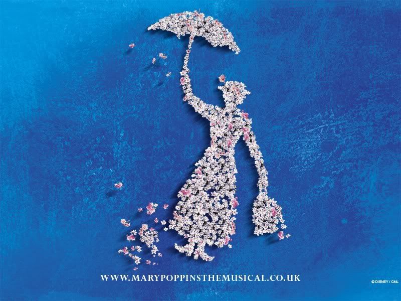
Posted: 4/30/06 at 1:31am
Kate2, the old London artwork is no longer on the website, but here's an example I had previously saved (it doesn't have the name of the show, but it gives you an idea of the look):
EganFan2
Broadway Star Joined: 9/8/04
#63re: MARY POPPINS Broadway Artwork Revealed...
Posted: 4/30/06 at 4:54pm^AH! So pretty. I love the blue. Too bad the tacky one's being used.
Broadway Star Joined: 12/31/69
#64re: MARY POPPINS Broadway Artwork Revealed...
Posted: 4/30/06 at 5:11pm
i think its bad design.
it makes it look like its a "ROLLICKIN' GOOD TIME!!!!" which is not the point...or if it is, this production has been greatly changed.
what i love so much about the london production is it makes peace between PL Traver's vision & Disney's version.
while i loved the Disney film all my life, reading the Travers books as an adult made me appreciate her original Mary Poppins more...there's so much more depth & spirit to it...& i think they did a good job of bringing that to the london stage version.
the original Mary Poppins would NEVER allow her charges to eat spoonfuls of sugar! why, the very idea!!!!
VinnieTheIceman
Featured Actor Joined: 9/22/03
#65re: MARY POPPINS Broadway Artwork Revealed...
Posted: 4/30/06 at 5:44pmThe story, whether we like it or not, is that the London production received good, but not great reviews, and is a modest success at best. They are hoping to create a mega-hit on Broadway more along the lines of Lion King. They hope to achieve that goal by making Mary a little more like Americans know her. The bottom line is afterall, the almighty dollar.
#66re: MARY POPPINS Broadway Artwork Revealed...
Posted: 4/30/06 at 5:58pmYeah, that's the artwork that London uses now too....it's the poster they have EVERYWHERE. THey got rid of the flowery one.
and all that I could do because of you was talk of love...
VinnieTheIceman
Featured Actor Joined: 9/22/03
#67re: MARY POPPINS Broadway Artwork Revealed...
Posted: 4/30/06 at 6:02pmThe flowery one was more mature and sophisticated (and much better imho). The new one reflects the direction they are taking the show.
Featured Actor Joined: 12/31/69
#68re: MARY POPPINS Broadway Artwork Revealed...
Posted: 5/1/06 at 6:43am
another reason i feel this is poor design is that it looks as if the umbrella has control of Mary Poppins, rather than the other way around. she looks like one of the nannies being blown away.
Mary Poppins should be in control @ *ALL* times.