

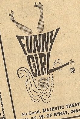
Funny Girl logo?
#1Funny Girl logo?
Posted: 9/22/11 at 11:16pm
The revival of funny girl logo. I like it. Even though I'm sure this will change extensively before the show reaches ny


KirbyCat
Broadway Legend Joined: 4/23/08
gcal
Leading Actor Joined: 10/19/04

#4Funny Girl logo?
Posted: 9/22/11 at 11:50pmPretty bland and boring.
"There’s nothing quite like the power and the passion of Broadway music. "
#5Funny Girl logo?
Posted: 9/23/11 at 12:03am
"Pretty bland and boring."
It's hardly worth ignoring.
chewy5000
Broadway Legend Joined: 12/1/09


#7Funny Girl logo?
Posted: 9/23/11 at 12:27amMerrily was the first thing that came to mind before the LuPone Gypsy logo. That, and Whistle Down the Wind. It's pretty generic.


#9Funny Girl logo?
Posted: 9/23/11 at 7:59amThat looks WAY too much like the Merrily logo.
"Jaws is the Citizen Kane of movies."
blocked: logan2, Diamonds3, Hamilton22
blocked: logan2, Diamonds3, Hamilton22
henrikegerman
Broadway Legend Joined: 4/29/05
#10Funny Girl logo?
Posted: 9/23/11 at 10:15amtotally bleh.... the original Funny Girl graphics were terrific! Why is it that branding/advertising art for the theater is so boring these day? For all the technical advancement, they just don't make them like they used to.
JasonM12480
Broadway Star Joined: 3/17/05
#11Funny Girl logo?
Posted: 9/23/11 at 1:32pm
"Why is it that branding/advertising art for the theater is so boring these day?"
Because there's very left creative genius and savvy left in today's world of processed mass media. This logo tells us nothing about the show, and pales in comparison to the original. And to think that the person who designed that probably just got a nice $18,000 paycheck.
Jon
Broadway Legend Joined: 2/20/04
#13Funny Girl logo?
Posted: 9/24/11 at 12:20pm
Ah yes - the original logo featuring a very 1960's looking girl with long hair (which neither Brice or Streisand had), on roller skates (even though there was no roller skate number by opening night).
Why not do a logo with her dressed as an Indian, or Baby Snooks (neither of which appear in the play)?
peerrjb
Featured Actor Joined: 7/7/09
#14Funny Girl logo?
Posted: 9/24/11 at 1:15pm
Haha.. Right, Jon. I always thought the rollerskate thing was funny (also the hairdon't).
As for this logo looking like "Merrily".... 95% of the contemporary public audience would not have any any any remembrance of that logo....Gee...or the show. It actually looks more like some GYPSY logos I've seen and seen and seen.
There IS, however, an interesting element to the wisdom behind the logo (even if the rendering isn't spectacular). The production team has indicated they are trying to make the show the "star". The logo says that rather bluntly. It also has a less-cutsie concept without an out-of-period "Girl"...because if the show is to be done right at all, it really AIN'T cutsie. It's darker than that, and the "Funny" is supposed to be ironic. As for the no-girl image -- it is, I think an option taken so's NOT to relate the show to a particular performer -- and after all, this NICK is being played by an actor with as much or more audience face-recognition quality as this FANNY.
#15Funny Girl logo?
Posted: 9/24/11 at 2:57pm
This looks like it's just the logo... there is a possibility there's other bits and pieces missing from the illustration?
Looks like a rush job...
"Are we being attacked or entertained?" - MST3K
My theatre poster/logo portfolio: http://www.listenterprises.com/
#16Funny Girl logo?
Posted: 9/25/11 at 7:57pm
![]()
I never liked the original 1960's logo of FUNNY GIRL, and I always found it funny when it was chopped up to fit marketing materials for stock, regional and dinner theatres. Check out how the original logo was mangled for a stock revival of the show with Mimi Hines.

#17Funny Girl logo?
Posted: 9/25/11 at 8:48pmMimi Hines was still doing this show in 1981? Oy vey! Didn't she replace Streisand in the original production?
peerrjb
Featured Actor Joined: 7/7/09
#18Funny Girl logo?
Posted: 9/26/11 at 3:57amWow....Mimi Hines in 1981??? If that's true, I'm surprised they didn't retitle the show "FUNNY SMELL".
CurtainPullDowner
Broadway Legend Joined: 11/4/04
#19Funny Girl logo?
Posted: 9/26/11 at 7:16amI think the original logo was done when the show was out of town and still had a roller skating number, the hair is another story. It's very Marlo Thomas in THAT GIRL.
Gaveston2
Broadway Legend Joined: 6/28/11
#20Funny Girl logo?
Posted: 9/26/11 at 2:41pm
I worked with Mimi Hines a couple of years ago and she smelled just fine, thank you very much. And she can still sing "I'm the Greatest Star" like it's 1967!
But, yeah, she would have been 48 in 1981. More than a bit old for Fanny.
#21Funny Girl logo?
Posted: 9/26/11 at 4:00pm
In all fairness to Ms. Hines, she turned 48 years old during the run of FUNNY GIRL at Melody Top. I wasn't there to see her, but I think she probably did just fine with Fanny in her forties. Thirty years ago the show would not have been produced without a "star" in the title role. She received excellent reviews, too:
"The diminutive songstress-comedian keeps the audience in the palm of her hand whether she is cracking wise or warming hearts with a melting performance of the song 'People.' Unlike too many performers who star at the summer music theatre in roles they've never seen before, Miss Hines has made the Fanny Brice role her own, on and off Broadway. It makes a whale of a difference."
I spoke briefly with Ms. Hines during a performance of NUNSENSE a few years ago, and she was thrilled to see younger fans in the audience. The woman can still sell a long, and she sounded great!
Gaveston2
Broadway Legend Joined: 6/28/11
#22Funny Girl logo?
Posted: 9/26/11 at 11:15pm
I worked with her at the Fabulous Palm Springs Follies about 4 years ago. She was as much beloved by the cast and crew as by the audience.
She can still sing the Funny Girl songs--including the big belt numbers--and she is an all-around lovely human being.
And those (like my husband) who remember her "Till There Was You" from 1950s TV practically melt into puddles when she sings it just as touchingly today.
She is quite literally one of my favorite stars I've ever worked with, on-stage and off.

#23Funny Girl logo?
Posted: 10/8/11 at 6:52am
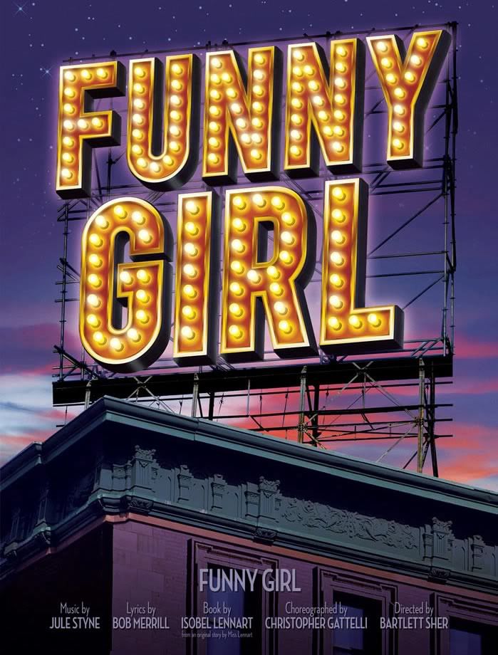
Welp, the artwork from the website is just the logo atop a theatre...