

Evolution of New Ragtime Poster Art

#1Evolution of New Ragtime Poster Art
Posted: 9/13/09 at 5:41pm
I am very grateful the Times did this. I LOVE stuff like this. So interesting.
I personally like the 3rd poster that they show the best. I love the center image with the woman, and would have loved to have seen it with production photos in the background.
What does everyone else think? Which is your favorite and why?
http://www.nytimes.com/interactive/2009/09/13/theater/20090913-ragtime-feature.html

TalkinLoud
Broadway Legend Joined: 3/3/09

#2re: Evolution of New Ragtime Poster Art
Posted: 9/13/09 at 5:58pmI like 2, 3 and 6 the best. It's odd that they had those options available and went with one of the worst ideas for the final art.
DrewBill
Stand-by Joined: 4/22/08
#3re: Evolution of New Ragtime Poster Art
Posted: 9/13/09 at 6:07pm
I really like the final poster art -- I find it a terrific blend of the old and modern, and a near perfect representation of an era of "change" that the show (and the novel) represents. And it's certainly better than a lot of other Broadway advertising graphics these days (I'm looking at you, Neil Simon Plays).
But I also find it very interesting that a number of the rejected ideas would have worked great as well.
Updated On: 9/13/09 at 06:07 PM

#4re: Evolution of New Ragtime Poster Art
Posted: 9/13/09 at 6:46pmI like the 5th one the best.
"You have two kinds of shows on Broadway – revivals and the same kind of musicals over and over again, all spectacles. You get your tickets for The Lion King a year in advance, and essentially a family... pass on to their children the idea that that's what the theater is – a spectacular musical you see once a year, a stage version of a movie. It has nothing to do with theater at all. It has to do with seeing what is familiar.... I don't think the theatre will die per se, but it's never going to be what it was.... It's a tourist attraction." Stephen Sondheim

WiCkEDrOcKS
Broadway Legend Joined: 6/13/04
#5re: Evolution of New Ragtime Poster Art
Posted: 9/13/09 at 6:49pm
I like the second slide the best. Simple and direct but nice to look at.
But the one they came up with in the end is really nice, IMO.
#6re: Evolution of New Ragtime Poster Art
Posted: 9/13/09 at 7:21pm#2 & #5 are the best. The one they picked is still the worst.
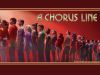
A Chorus Line revival played its final Broadway performance on August 17, 2008. The tour played its final performance on August 21, 2011. A new non-equity tour started in October 2012 played its final performance on March 23, 2013. Another non-equity tour launched on January 20, 2018. The tour ended its US run in Kansas City and then toured throughout Japan August & September 2018.

#7re: Evolution of New Ragtime Poster Art
Posted: 9/13/09 at 7:24pm
I like the 6th one. It's similar to the one they have now, but it flows SO much better.
I also like 2 and 5.
Updated On: 9/13/09 at 07:24 PM
RentBoy86
Broadway Legend Joined: 2/15/05
#8re: Evolution of New Ragtime Poster Art
Posted: 9/13/09 at 7:33pmI love the 3rd one. How original for a period piece. It probably doesn't suite the production as well as the one they have now, but I think it's really interesting and def. would have caught a few eyes.
AwesomeDanny
Broadway Legend Joined: 7/30/09

#10re: Evolution of New Ragtime Poster Art
Posted: 9/13/09 at 8:07pm
What a wonderful feature... I'm still a fan of the final decision, but I think any of those pieces are suitable. I love that this is one of the few Broadway posters I can think of that could stand on its own as a piece of art. I'm also glad to see a Broadway poster that is creative, as opposed to a headshot of whomever is starring in the show. I'm very excited to see this production.
"...everyone finally shut up, and the audience could enjoy the beginning of the Anatevka Pogram in peace."
Updated On: 9/13/09 at 08:07 PM
snowskittle
Leading Actor Joined: 1/10/09
#11re: Evolution of New Ragtime Poster Art
Posted: 9/13/09 at 8:38pm
5 is the best of the lot, but it still needs work. I really like the flag and Coalhouse in the blue.
But the logo at the bottom needs work.
Still, I think it's the best of the lot.
#12re: Evolution of New Ragtime Poster Art
Posted: 9/13/09 at 8:50pm
I can't stand the OBC artwork, but the first flag one shown in that feature is my favorite. I love the simplicity, and that it uses the flag without being so obvious about it. I do really like the artwork they settled on, though.
Updated On: 9/14/09 at 08:50 PM
Chrysanthemum62001
Broadway Legend Joined: 2/14/04
#13re: Evolution of New Ragtime Poster Art
Posted: 9/13/09 at 8:58pmI also think they picked one of the worst sketches for the artwork. personally, I think they should have gone with the first flag one. The one they picked just looks like something exploded.
"What a mystery this world. One day you love them and the next day you want to kill them a thousand times over." The Masked Bandit in THE FALL
#14re: Evolution of New Ragtime Poster Art
Posted: 9/13/09 at 9:04pm2 and 5 are my favorites. But I like the final art as well.
"i had no idea billy elliot was about one boy's triumph over epilepsy."-FindingNamo
#15re: Evolution of New Ragtime Poster Art
Posted: 9/13/09 at 9:07pm
"The one they picked just looks like something exploded."
Like an era?
"...everyone finally shut up, and the audience could enjoy the beginning of the Anatevka Pogram in peace."
AndAllThatJazz22
Broadway Legend Joined: 11/8/08
#16re: Evolution of New Ragtime Poster Art
Posted: 9/13/09 at 9:23pmThe 2nd one was the best. I think the final artwork is WAY too modern.
"There's nothing good on. The media hates Christmas. The media loves vampires, though. Maybe they will show a Twilight Christmas."
-Danmeg's 10 year old son.
-Danmeg's 10 year old son.
RentBoy86
Broadway Legend Joined: 2/15/05
#17re: Evolution of New Ragtime Poster Art
Posted: 9/13/09 at 10:35pmIs it bad that I want to go while it's in previews so I can have a color playbill? Ha.
#18re: Evolution of New Ragtime Poster Art
Posted: 9/13/09 at 10:49pm
I like the second and fifth ones.
The final art bugs me but I honestly can't figure out why.
"You mean what was the best picture of the year or what did they pick as the best picture of the year?" - California Suite
#19re: Evolution of New Ragtime Poster Art
Posted: 9/13/09 at 11:06pm
If I knew nothing about the show, the current art wouldn't make me feel like I need to see the show. For whatever reason #3 grabs me and pulls me in.
I'm just happy this modern masterpiece is coming back to Broadway. May it have a long, long, long run!

#20re: Evolution of New Ragtime Poster Art
Posted: 9/13/09 at 11:29pm#3 wins it for me.
"Jaws is the Citizen Kane of movies."
blocked: logan2, Diamonds3, Hamilton22
blocked: logan2, Diamonds3, Hamilton22
morosco
Broadway Legend Joined: 7/10/04
SDav 10495
Broadway Star Joined: 7/21/06
#22re: Evolution of New Ragtime Poster Art
Posted: 9/13/09 at 11:58pm
Gaahh...New York Times, I love you. I live for features like this.
#3 is quite striking. I agree with the way Kyle put it--it's the artwork that most makes me feel like I really need to see this show.
But I do like the final product. The artwork on its own is terrific--elements like the Obama-era "HOPE" button among all the early-1900s paraphernalia instantly make a case for the show's relevance in 2009. The only thing bugging me is their treatment of the title...the "big-small-big" lettering looks a little too funky to me.
"If there is going to be a restoration fee, there should also be a Renaissance fee, a Middle Ages fee and a Dark Ages fee. Someone must have men in the back room making up names, euphemisms for profit."
(Emanuel Azenberg)

#23re: Evolution of New Ragtime Poster Art
Posted: 9/13/09 at 11:58pmThe final one doesn't really flow and seems off-balance. It reminds me of the latest Time Out New York cover.
"I mean, sitting side by side with another man watching Patti LuPone play Rose in GYPSY on Broadway is essentially the equivalent of having hardcore sex." -Wanna Be A Foster.
"Say 'Goody.' Say 'Bubbi.'" ... "That's it. Exactly as if it were 'Goody.' Now I know you're gonna sing 'Goody' this time, but nevertheless..."
SDav 10495
Broadway Star Joined: 7/21/06
#24re: Evolution of New Ragtime Poster Art
Posted: 9/14/09 at 12:01am
The final one doesn't really flow and seems off-balance. It reminds me of the latest Time Out New York cover.
YES. That's what it reminded me of. I still like it.
(Incidentally, I think a nice shout-out to "Ragtime" was included in that cover art...?)
"If there is going to be a restoration fee, there should also be a Renaissance fee, a Middle Ages fee and a Dark Ages fee. Someone must have men in the back room making up names, euphemisms for profit."
(Emanuel Azenberg)
Updated On: 9/14/09 at 12:01 AM