

THE VISIT presale and new artwork
#1THE VISIT presale and new artwork
Posted: 1/26/15 at 10:27am
THE VISIT presale has begun. You can get 2,500 bonus points. I just purchased Orchestra A101 for the first preview. So excited.
And the artwork can be seen here: http://m.audiencerewards.com/offersview.cfm?venueid=102&showid=2975
MUCH better. Looks beautiful.
Updated On: 1/26/15 at 10:27 AM

#2THE VISIT presale and new artwork
Posted: 1/26/15 at 10:31amI do like the logo itself, but I hope the poster is something more than a photo of Chita standing there.
"...everyone finally shut up, and the audience could enjoy the beginning of the Anatevka Pogram in peace."

Cupid Boy2
Broadway Legend Joined: 1/5/13
#2THE VISIT presale and new artwork
Posted: 1/26/15 at 11:08amThe logo is gorgeous, and Chita looks stunning. Very excited for this.

Smaxie
Broadway Legend Joined: 9/26/05
#3THE VISIT presale and new artwork
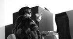
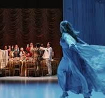
Posted: 1/26/15 at 3:10pm

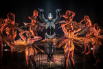
Full image
Plus, the NY Times has a story about the shoot. http://artsbeat.blogs.nytimes.com/2015/01/26/behind-the-poster-the-visit/
Begin at the beginning and go on till you come to the end: then stop.
Updated On: 1/26/15 at 03:10 PM
#4THE VISIT presale and new artwork
Posted: 1/26/15 at 3:12pmIt's perfect! That's the eeriness I was hoping for.

#5THE VISIT presale and new artwork
Posted: 1/26/15 at 3:32pmI wasn't too impressed with the image on Audience Rewards, but wow I love the full image! Very striking and evocative!
#6THE VISIT presale and new artwork
Posted: 1/26/15 at 3:42pmYes, the full image is wonderful. Very creepy.
"...everyone finally shut up, and the audience could enjoy the beginning of the Anatevka Pogram in peace."
Fantod
Broadway Legend Joined: 10/3/14
#8THE VISIT presale and new artwork
Posted: 1/26/15 at 3:50pmLove it!
"You can't overrate Bernadette Peters. She is such a genius. There's a moment in "Too Many Mornings" and Bernadette doing 'I wore green the last time' - It's a voice that is just already given up - it is so sorrowful. Tragic. You can see from that moment the show is going to be headed into such dark territory and it hinges on this tiny throwaway moment of the voice." - Ben Brantley (2022)
"Bernadette's whole, stunning performance [as Rose in Gypsy] galvanized the actors capable of letting loose with her. Bernadette's Rose did take its rightful place, but too late, and unseen by too many who should have seen it" Arthur Laurents (2009)
"Sondheim's own favorite star performances? [Bernadette] Peters in ''Sunday in the Park,'' Lansbury in ''Sweeney Todd'' and ''obviously, Ethel was thrilling in 'Gypsy.'' Nytimes, 2000
Fantod
Broadway Legend Joined: 10/3/14
#9THE VISIT presale and new artwork
Posted: 1/26/15 at 3:51pmThe way her dress is makes it almost look like she is a ghost. The more I look at it, the more I like it.
#10THE VISIT presale and new artwork
Posted: 1/26/15 at 3:51pmNot even a ghost- an angel of death.
"...everyone finally shut up, and the audience could enjoy the beginning of the Anatevka Pogram in peace."
MusicAndPassion
Broadway Star Joined: 9/14/05
#11THE VISIT presale and new artwork
Posted: 1/26/15 at 3:58pmMuch better! Glad the darkness and yellow from the show were added to it. But just like the show itself, it's nothing more than Chita Rivera just standing there.
#12THE VISIT presale and new artwork
Posted: 1/26/15 at 3:59pmLove it.
"There’s nothing quite like the power and the passion of Broadway music. "
#14THE VISIT presale and new artwork
Posted: 1/26/15 at 4:42pmReally like it, I think it captures the idea of the show without giving away much.
#15THE VISIT presale and new artwork
Posted: 1/26/15 at 4:46pm
Love it.
Can not wait to see this.
....but the world goes 'round
#16THE VISIT presale and new artwork
Posted: 1/26/15 at 4:56pm
I like the logo, and the artwork itself is beautiful, but the poster as whole doesn't tell me anything about the show. If I were a tourist from middle America who had to decide between seeing WICKED, CHICAGO or something new like THE VISIT... nothing in this poster would make me choose the Visit unless I were a huge Chita fan, but that didn't do much for THE MYSERY OF EDWIN DROOD revival a few years back.
The poster doesn't even really advertise the fact that it's a KANDER & EBB musical, it just lists their names at the bottom as if no one famous wrote the music.
I miss the blood drop logo from past incarnations, and I think they should add the mysterious men in white masks from the publicity photos behind her... to give people a sense that this musical is mysterious and possibly deadly and also a good ole KANDER & EBB production.
Just my thoughts... I can't seem to get a job in Broadway PR so maybe I should just keep my mouth shut, lol.
#17THE VISIT presale and new artwork
Posted: 1/26/15 at 5:05pm
But the eeriness of the artwork could entice people to find out more about the show. I think it's perfect.
Before the image was released, my imagination created an image of Chita's silhouette in a smokey train station, and that's pretty similar to what we have! The eerie train station IS the set for this production, so I am thrilled to see that it's the setting for the artwork.
Visceral_Fella
Broadway Legend Joined: 1/18/12
#18THE VISIT presale and new artwork
Posted: 1/26/15 at 5:07pmI really like the new artwork, hated what they used at WTF
#19THE VISIT presale and new artwork
Posted: 1/26/15 at 6:34pm
ljay,It's perfect! That's the eeriness I was hoping for.
---
I agree, There she is front and center back at the station ~ Elegant & Alluring!
"Anything you do, let it it come from you--then it will be new."
Sunday in the Park with George
RippedMan
Broadway Legend Joined: 8/14/05
#20THE VISIT presale and new artwork
Posted: 1/26/15 at 8:25pmI hate that. The actual title looks like it's a fun comedy romp. And the poster itself is just kind of dull. It doesn't really entice me, and I'm someone who wants to see this show.Yellow is just not a very scary color...

#21THE VISIT presale and new artwork
Posted: 1/26/15 at 8:31pmtotally agree with RippedMan. The Yellow makes me think its a comedy. Although chita and everything around her looks great. I can't wait!
Use my fabulous TodayTix code: JEYCY
sctrojan65
Featured Actor Joined: 10/24/14
#22THE VISIT presale and new artwork
Posted: 1/26/15 at 9:22pmI think it looks great. Super way to showcase this grand dame of Broadway.
sctrojan65
Featured Actor Joined: 10/24/14
#23THE VISIT presale and new artwork
Posted: 1/27/15 at 2:05amPlanning a trip to NYC in April and was wondering for those of you who have access to the pre-sale site….I will be in NY on April 2, 3, 4, and 5. Are there matinees for The Visit on April 2 or 3. Or is there an evening performance for April 5? Thanks.

#24THE VISIT presale and new artwork
Posted: 1/27/15 at 2:25am
No to each of your questions.
April 2 8 pm
April 3 8 pm
April 4 2 and 8 pm
April 5 3 pm