

Best Broadway Ad Campaigns/Designs of All Time
BroadwayConcierge
Broadway Legend Joined: 7/24/15
#1Best Broadway Ad Campaigns/Designs of All Time
Posted: 8/30/16 at 11:24am
Are there any Broadway productions in recent or long-standing history for which the marketing/ad design blew you away? This can range from the show's logo to poster to any other form of advertising collateral (commercials, etc.). Enclosing pictures and/or videos would be great to keep the discussion going.
I, for one, will always adore AAIP's design.
neonlightsxo
Broadway Legend Joined: 7/29/08
#2Best Broadway Ad Campaigns/Designs of All Time
Posted: 8/30/16 at 11:38am
Something Rotten has had an excellent ad campaign.
#3Best Broadway Ad Campaigns/Designs of All Time
Posted: 8/30/16 at 11:42am
I love the Hamilton ad campaign and designs.
In our millions, in our billions, we are most powerful when we stand together. TW4C unwaveringly joins the worldwide masses, for we know our liberation is inseparably bound.
Signed,
Theater Workers for a Ceasefire
https://theaterworkersforaceasefire.com/statement
broadwayguy91
Broadway Star Joined: 12/23/15
#4Best Broadway Ad Campaigns/Designs of All Time
Posted: 8/30/16 at 11:45am
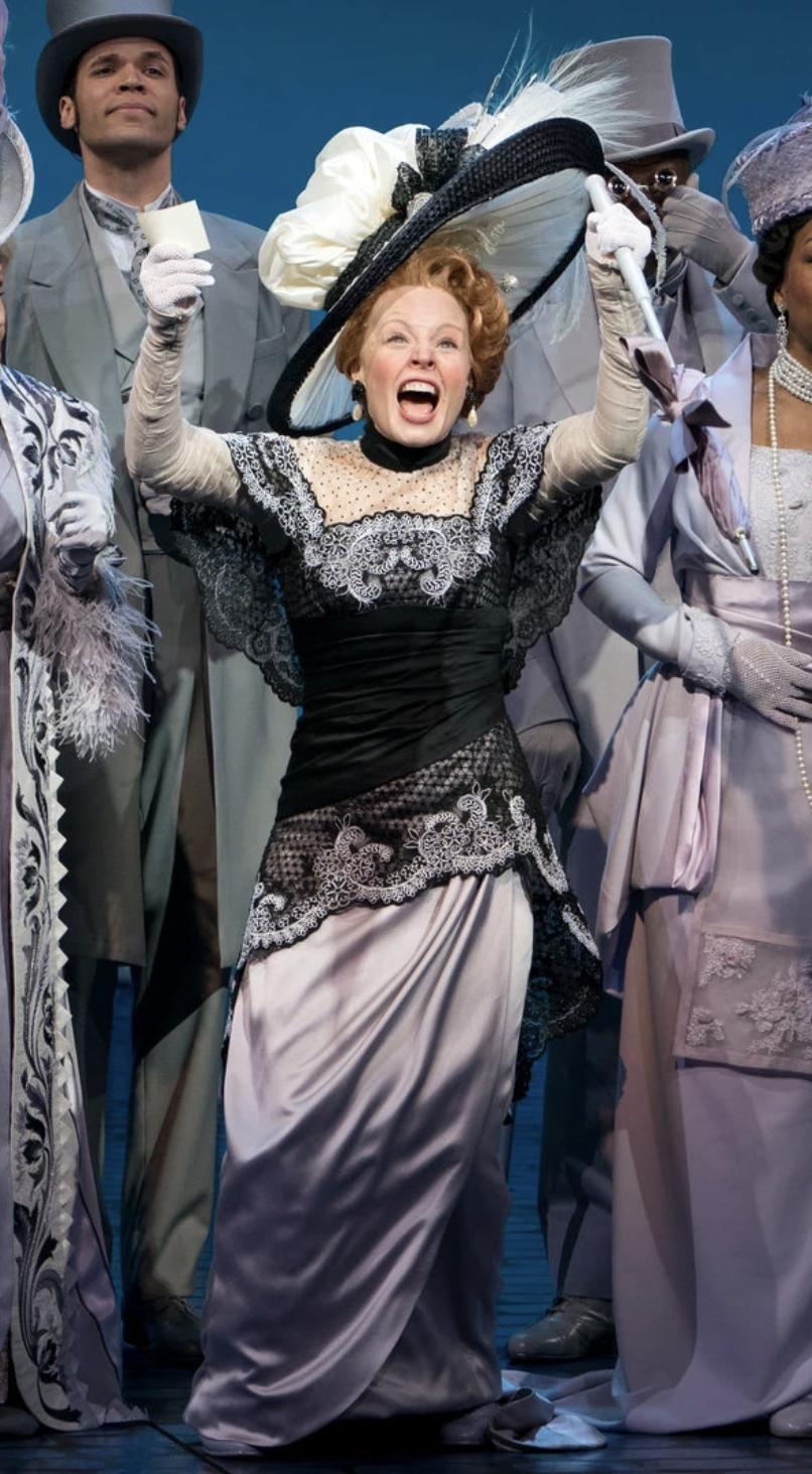
Liza's Headband
Broadway Legend Joined: 5/28/13
#5Best Broadway Ad Campaigns/Designs of All Time
Posted: 8/30/16 at 11:45am
Are we talking about what we "like" the most or what has been the most impactful/influential??? There's a massive difference. Love them or hate them, the gentleman (and firm) behind ALW's properties Cats and Phantom of the Opera really reshaped the landscape. I'd also argue that the original ad campaign and marketing plan for Les Miserables was pretty revolutionary; no pun intended.
BroadwayConcierge
Broadway Legend Joined: 7/24/15
#6Best Broadway Ad Campaigns/Designs of All Time
Posted: 8/30/16 at 11:47am
I'm not looking for impactful necessarily, Headband, as that would require a much more detailed conversation involving sales and the like (I appreciate your clarifying!). I'm just curious which posters have made heads turn or have stuck in peoples' minds since they first saw them, even if the show ended up flopping. More aesthetic than anything else.
Patty3
Featured Actor Joined: 2/24/07
#7Best Broadway Ad Campaigns/Designs of All Time
Posted: 8/30/16 at 11:49am
I second Something Rotten! I am also enjoying the teaser videos they have been putting out for Charlie and the Chocolate factory. There have been 3 so far and they keep getting better.
As far as graphics go I loved the Shuffle Along art and the new Anastasia art is really well done.
bdboston
Featured Actor Joined: 12/13/06
#8Best Broadway Ad Campaigns/Designs of All Time
Posted: 8/30/16 at 1:08pm
I always like the stories about marketing/advertising concepts for Broadway shows that didn't make the cut. I recall "Wicked" had some very interesting conceptual designs. In searching for those images online, I came across a similar story from Bloomberg re. unused marketing designs for "Hamilton":
Here Are All the Hamilton Posters That Didn't Make it to Broadway

#9Best Broadway Ad Campaigns/Designs of All Time
Posted: 8/30/16 at 1:23pm
Whether or not these are the best logos of all time can certainly be debated, but I have to give it up to Cameron Mackintosh and Dewynters who gave us the designs for Cats, Les Miserables, The Phantom of the Opera and Miss Saigon. Maybe even their 90s Oliver logo as well. All of the designs became relatively synonymous with the title of the show to the point where the ad didn't need to feature the title of the show at all to be effective. If you saw the yellow eyes with the dancers inside you knew it was Cats. If you saw the illustration of Cosette you knew it was a Les Miz ad. It didn't need the title of the show. For a long time the same was true of the mask and rose for Phantom. There was an ad that read "Remember your first time..." and didn't say Phantom of the Opera anywhere but you knew what the ad was for. Whether you like the shows or not all marketing for musicals should strive for that kind of artistry.

#10Best Broadway Ad Campaigns/Designs of All Time
Posted: 8/30/16 at 1:23pm
Here's the thing:
Something Rotten's ad campaign was extremely clever, and very good in its own rite. The problem is that that the ads were, in my opinion, significantly funnier than the show itself. My own opinions of the show aside, I think I would even venture to say that the style of humor in the ad campaign was objectively different from what's actually in the show.
Still, I guess it did the trick since it got people in the seats.
#11Best Broadway Ad Campaigns/Designs of All Time
Posted: 8/30/16 at 1:49pm
The original Pippin had a great ad campaign of using television to its advantage. Here's a clip of the original "here's a free minute" commercial.
https://www.youtube.com/watch?v=bo4Tz-4rkvs
For teaser marketing, Cats had great marketing by just putting up the marquee with nothing else. Same with Nine where they just put up the pictures of the ladies and nothing else.

#13Best Broadway Ad Campaigns/Designs of All Time
Posted: 8/30/16 at 3:47pm
A Gentleman's Guide to Love and Murder has had my favorite marketing in recent memory.
I agree with whomever said that Something Rotten's marketing is funnier than the actual show, and the sense of humor is at odds with the sense of humor of the show itself. The Gentleman's Guide marketing, by contrast, fit in perfectly with the tone of the show.
#14Best Broadway Ad Campaigns/Designs of All Time
Posted: 8/30/16 at 4:47pm
Several already mentioned have been recent favorites of mine -- Something Rotten, Gentleman's Guide -- and I'll add Hand to God for doing some super clever advertising. I loved the Playbill ads they did that were customized to the show they were being printed in.
BakerWilliams
Leading Actor Joined: 2/1/16
#15Best Broadway Ad Campaigns/Designs of All Time
Posted: 8/30/16 at 5:11pm
perfectlymarvelous said: "A Gentleman's Guide to Love and Murder has had my favorite marketing in recent memory.
I agree with whomever said that Something Rotten's marketing is funnier than the actual show, and the sense of humor is at odds with the sense of humor of the show itself. The Gentleman's Guide marketing, by contrast, fit in perfectly with the tone of the show.
"
Gentleman's Guide and Something Rotten oddly enough have really similar marketing styles.
#16Best Broadway Ad Campaigns/Designs of All Time
Posted: 8/31/16 at 8:54am
Poster wise, the 1988 Broadway poster for Carrie was a stunning design
Well I didn't want to get into it, but he's a Satanist.
Every full moon he sacrifices 4 puppies to the Dark Lord and smears their blood on his paino.
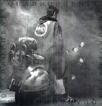
This should help you understand the score for Wicked a little bit more.
Tazber's: Reply to
Is Stephen Schwartz a Practicing Christian


chewy5000
Broadway Legend Joined: 12/1/09
#19Best Broadway Ad Campaigns/Designs of All Time
Posted: 8/31/16 at 2:37pm
Taryn said: "Several already mentioned have been recent favorites of mine -- Something Rotten, Gentleman's Guide -- and I'll add Hand to God for doing some super clever advertising. I loved the Playbill ads they did that were customized to the show they were being printed in."
Aah yes I forgot about Hand to God! Those Playbill ads were high quality.

#20Best Broadway Ad Campaigns/Designs of All Time
Posted: 9/1/16 at 11:51pm
Actually, I would say "Something Rotten" had TWO clever ad campaigns. The first involved the cartoons of various characters and the second was the one about inviting people to see a Tony loser. I thought they were both brilliant (as was the show, IMO).
Regarding The Phantom of the Opera, I'm staring at my wall, which is full of various posters. The mask and rose are great, although the rose comes and goes. (The rose image does not actually have much to do with the original show, but they're linked in the audience members' minds). The Phantom poster (I don't know if it's an ad) with a mask and background made up of hundreds of small phantom scenes and masks, like a Seurat painting, is brilliant. The touring ones, with a red background, instead of black or blue, and gold lettering are just blah, in my view. However, the one that does not qualify as sensible or attractive at all is the 20th anniversary poster:
https://www.musicmotion.com/Broadway-Posters/phantom-of-the-opera-poster.asp
Audrey, the Phantom Phanatic, who nonetheless would rather be Jean Valjean, who knew how to make lemonade out of lemons.