

AMERICAN PSYCHO to the Schoenfeld

#1AMERICAN PSYCHO to the Schoenfeld
Posted: 9/30/15 at 4:17pm
It officially has a home--I hope a cast list isn't too far behind!

#2AMERICAN PSYCHO to the Schoenfeld
Posted: 9/30/15 at 4:34pm
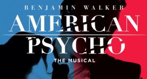
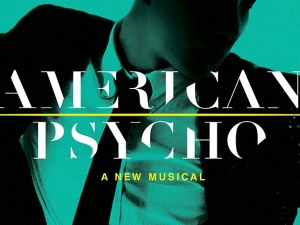
Is it too late to hope the artwork on their website isn't the final version? Why green? And why text that most will have to stop and stare at for a few seconds to figure out what it says? And who in New York would stop and stare at anything for that long? Patrick Bateman would never approve of that font type.
Updated On: 9/30/15 at 04:34 PM
#3AMERICAN PSYCHO to the Schoenfeld
Posted: 9/30/15 at 6:23pm
Now if Waitress were to transfer to the Nederlander, Spring Awakening could extedn and Duncan Sheik could have two shows on Broadway at once...

#4AMERICAN PSYCHO to the Schoenfeld
Posted: 9/30/15 at 6:51pm
^We'll have to wait and see if the grosses for Spring Awakening will end up being good enough to warrant a longer run.

#5AMERICAN PSYCHO to the Schoenfeld
Posted: 9/30/15 at 7:29pm
I love the website artwork. Hope the t-shirt is that color.
Just give the world Love.

Cupid Boy2
Broadway Legend Joined: 1/5/13
#6AMERICAN PSYCHO to the Schoenfeld
Posted: 9/30/15 at 7:40pm
I love the artwork on the website as well. The font used for the title looks terrible alone on a white background in the press release, though.
Updated On: 9/30/15 at 07:40 PM
#7AMERICAN PSYCHO to the Schoenfeld
Posted: 9/30/15 at 7:55pm
I like the artwork, the color and the font, which is so very appropriate, being "chopped up."
get it?
<-----I'M TOTES ROLLING MY EYES
rjm516
Broadway Legend Joined: 6/24/09
#8AMERICAN PSYCHO to the Schoenfeld
Posted: 9/30/15 at 10:39pm
Damnnn between this, Hamilton, Waitress, Allegiance, Shuffle, and more this is a really exciting season for new works on Bway!
#9AMERICAN PSYCHO to the Schoenfeld
Posted: 10/1/15 at 12:13pm
This season is putting me further into debt! LOL. Its been a while since we have had a season this exciting ;o)
RippedMan
Broadway Legend Joined: 8/14/05
#11AMERICAN PSYCHO to the Schoenfeld
Posted: 10/1/15 at 5:36pm
LOVE the logo. One of my favorites in recent years
#12AMERICAN PSYCHO to the Schoenfeld
Posted: 10/26/15 at 5:55pm
Hey I can read the title now. And the blue and red is nice if not a little on the nose.

#13AMERICAN PSYCHO to the Schoenfeld
Posted: 10/26/15 at 6:18pm
I listened to the songs, and I like them. On the fence with the one that just lists a lot of brand names (I forget what it's called), so depending on the scene, I could see myself loving or loathing it. The others are dark and different.
Updated On: 10/26/15 at 06:18 PM#14AMERICAN PSYCHO to the Schoenfeld
Posted: 10/26/15 at 7:12pm
"Selling Out" seems to be new. I also kind of love Duncan Sheik doing the dialogue for all the characters. It makes Patrick sound even more psychotic.
Updated On: 10/26/15 at 07:12 PM
ajh
Broadway Star Joined: 5/6/11
#15AMERICAN PSYCHO to the Schoenfeld
Posted: 10/26/15 at 8:33pm
The 'brand name' song ("You Are What You Wear"![]() was a bit of a showstopper in the London production. It was performed by all the women in the cast (including Bateman's shallow girlfriend and her ghastly best friend) the harmonies were rather gorgeous and the Vogue(as in the dance)-like choreography was a riot and had a great build to it. One of my favourite numbers actually,
was a bit of a showstopper in the London production. It was performed by all the women in the cast (including Bateman's shallow girlfriend and her ghastly best friend) the harmonies were rather gorgeous and the Vogue(as in the dance)-like choreography was a riot and had a great build to it. One of my favourite numbers actually,
Anthony Fremont
Swing Joined: 6/16/10
#16AMERICAN PSYCHO to the Schoenfeld
Posted: 10/26/15 at 8:51pm
ajh said: "The 'brand name' song ("You Are What You Wear"![]() was a bit of a showstopper in the London production. It was performed by all the women in the cast (including Bateman's shallow girlfriend and her ghastly best friend) the harmonies were rather gorgeous and the Vogue(as in the dance)-like choreography was a riot and had a great build to it. One of my favourite numbers actually."
was a bit of a showstopper in the London production. It was performed by all the women in the cast (including Bateman's shallow girlfriend and her ghastly best friend) the harmonies were rather gorgeous and the Vogue(as in the dance)-like choreography was a riot and had a great build to it. One of my favourite numbers actually."
Also a nice compliment to the business card number.
Updated On: 10/26/15 at 08:51 PM
#17AMERICAN PSYCHO to the Schoenfeld
Posted: 10/26/15 at 8:56pm
I love the blue and red. Possibly because I can barely read the green one.

#18AMERICAN PSYCHO to the Schoenfeld
Posted: 10/26/15 at 9:24pm
I have no problem at all reading the text on that green and love the color. Might be a color perception difference thing. Red, white, and blue seems a bit obvious.
Updated On: 10/26/15 at 09:24 PM#19AMERICAN PSYCHO to the Schoenfeld
Posted: 10/26/15 at 9:49pm
They have at least taken it in a better direction by fixing the text. The colors are obvious but they make more sense than green. I'd rather have a window card in all red or all blue rather than the half blue and half red.
TerrenceIsTheMann
Broadway Star Joined: 9/28/15
#20AMERICAN PSYCHO to the Schoenfeld
Posted: 10/26/15 at 10:10pm
It's two colors for a reason. Two colors. Two sides. Two faced.
#21AMERICAN PSYCHO to the Schoenfeld
Posted: 10/26/15 at 10:26pm
I liked the green one better.![]()
<-----I'M TOTES ROLLING MY EYES

#22AMERICAN PSYCHO to the Schoenfeld
Posted: 10/26/15 at 11:14pm
TerrenceIsTheMann said: "It's two colors for a reason. Two colors. Two sides. Two faced.
"
GASP