

The Bridges of Madison County New Logo
RW3
Broadway Legend Joined: 7/20/13
#1The Bridges of Madison County New Logo
Posted: 3/6/15 at 4:47pm
It's fine I guess.
Bridges Facebook page
Updated On: 3/6/15 at 04:47 PM
#2The Bridges of Madison County New Logo
Posted: 3/6/15 at 5:37pm
I don't know if it's the font or what but it's very Choose Your Own Adventure to me.
"Pardon my prior Mcfee slip. I know how to spell her name. I just don't know how to type it." -Talulah

#2The Bridges of Madison County New Logo
Posted: 3/6/15 at 5:42pmI don't mind the image but I really don't like the font. They've really had a rough time marketing this show.

#3The Bridges of Madison County New Logo
Posted: 3/6/15 at 6:08pmI wish they kept everything the same as the last broadway poster but obviously just change the picture of the leads.. it looks very cheap and high school production like.
rjm516
Broadway Legend Joined: 6/24/09
#4The Bridges of Madison County New Logo
Posted: 3/6/15 at 6:12pmYeesh. Could they not use the purple/blue one because of legal reasons? If they could have used it, and instead chose this crap, well that's inexcusable.
#5The Bridges of Madison County New Logo
Posted: 3/6/15 at 6:46pmI actually like it.
"There’s nothing quite like the power and the passion of Broadway music. "

bwaylyric
Broadway Legend Joined: 10/22/03
#6The Bridges of Madison County New Logo
Posted: 3/6/15 at 7:15pmI think the "of Madison County" part should be bigger than "the musical"
Auggie27
Broadway Legend Joined: 10/13/03
#7The Bridges of Madison County New Logo
Posted: 3/6/15 at 7:43pmI like it. It has a classic Americana look (anyone else remember SHENANDOAH's? Same idea) that might sell the show better than a superimposed photo of two unknown actors. It doesn't suggest romance novel; rather than amateur, it looks vintage.
"I'm a comedian, but in my spare time, things bother me." Garry Shandling

#8The Bridges of Madison County New Logo
Posted: 3/6/15 at 7:49pm
For some reason having them in the painting bugs me.
And they have to make Madison County bigger.
Otherwise I like the tone better than the Bway version.
....but the world goes 'round
#9The Bridges of Madison County New Logo
Posted: 3/6/15 at 8:14pmit looks like the same concept from Little House on the Prairie musical. BIG words and a small cartoon picture. I kind of feel like getting the broadway poster and tell the actors to sign that one. Cause the new poster looks ugly.

#10The Bridges of Madison County New Logo
Posted: 3/6/15 at 9:05pmI'm glad they're refocusing the advertising to highlight... the bridges.
"...everyone finally shut up, and the audience could enjoy the beginning of the Anatevka Pogram in peace."
#11The Bridges of Madison County New Logo
Posted: 3/6/15 at 9:10pmNone of the artwork for this show has worked and I don't think this will either but the show is beautiful and I hope the tour does well. I'm just trying to figure out what was wrong with the pretty blue artwork and logo.
RippedMan
Broadway Legend Joined: 8/14/05
#12The Bridges of Madison County New Logo
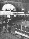
Posted: 3/7/15 at 1:08amI rather liked the original with the red barn background and the logo. I thought that was simple and pretty. But none of it highlights the story of a love affair.

seahag2
Featured Actor Joined: 2/15/15
#13The Bridges of Madison County New Logo
Posted: 3/7/15 at 2:14am

The new logo really reminded me of the knock off Frozen movie artwork for some reason. oops. Why is BRIDGES sooooo giant?
and this is a bit upsetting because I really loved the font and color choices for the old art.
so I smile like Mona Lisa and I lay my Visa down

#14The Bridges of Madison County New Logo
Posted: 3/7/15 at 8:55amI like everything about it except for the bridge itself. It looks more like a big metal Winnebago, than an old wooden bridge.
Art has a double face, of expression and illusion.
Mr Roxy
Broadway Legend Joined: 5/17/03
#15The Bridges of Madison County New Logo
Posted: 3/7/15 at 10:55am
I remember the Bridge on stage looked like it was made from a little kids toy set
Glad this show is having a life after Broadway.
Poster Emeritus
Updated On: 3/7/15 at 10:55 AM
#16The Bridges of Madison County New Logo
Posted: 3/9/15 at 9:24pm

So I was looking at the Ahmanson Theatre's website and they have a sort of revised version of the new logo!

#17The Bridges of Madison County New Logo
Posted: 3/9/15 at 9:26pmApparently there will be an announcement tomorrow.
ebontoyan
Broadway Star Joined: 9/22/14
#18The Bridges of Madison County New Logo
Posted: 3/9/15 at 10:18pmBridges will launch their national tour in Des Moines, Iowa!!! Excited to see this show!
#19The Bridges of Madison County New Logo
Posted: 3/9/15 at 10:30pmI wouldn't mind that Ahmanson artwork with the Broadway title treatment.

#20The Bridges of Madison County New Logo
Posted: 3/9/15 at 10:30pmLooks like Oregon Trail to me...
Sutton Ross
Broadway Legend Joined: 7/20/13
#21The Bridges of Madison County New Logo
Posted: 3/9/15 at 10:54pm
Yes! Oregon Trail! I was trying to think of where I saw that before.
Sigh. They just can't get this thing right. Dag, I miss this show.
jacobsnchz14
Broadway Legend Joined: 12/13/06
#22The Bridges of Madison County New Logo
Posted: 3/10/15 at 5:52pmThe website has gone throughb a redesign... www.bridgesmusical.com
sklabam
Stand-by Joined: 11/27/11