

MAMMA MIA! marquee is up at the Broadhurst
#25MAMMA MIA! marquee is up at the Broadhurst
Posted: 8/26/13 at 11:23pmI really hope they don't revert to the tour set. It looked like shipping boxes stacked up to make walls.
"There’s nothing quite like the power and the passion of Broadway music. "

#26MAMMA MIA! marquee is up at the Broadhurst
Posted: 8/26/13 at 11:30pmOH, so they aren't going to change that old logo? ...Even after moving? For those who have seen the show before, is it "all that"?

#27MAMMA MIA! marquee is up at the Broadhurst
Posted: 8/26/13 at 11:37pm
Eesh. In my dream of dreams it was made of electric blue sparkle pieces with the title in white negative space.
Damn I want to design a front of house now.
Here_I_Go_Again
Broadway Star Joined: 9/17/03
#28MAMMA MIA! marquee is up at the Broadhurst
Posted: 8/26/13 at 11:53pm
What is the difference between the London set and the last US tour set?
Updated On: 8/26/13 at 11:53 PM
broadwayguy2
Broadway Legend Joined: 5/18/03
#29MAMMA MIA! marquee is up at the Broadhurst
Posted: 8/27/13 at 2:52amThe current London set, for all intents and purposes, is the same design ised fpr the last North American leg of the tour (split week bus and yruck) and last Australia tour. It is also used in small markets. Boxy, awkward, with every last bell and whistle cut from the show. No flash, no sparkle.
TheaterBoy7777
Broadway Star Joined: 1/28/06
#30MAMMA MIA! marquee is up at the Broadhurst
Posted: 10/23/13 at 10:46am
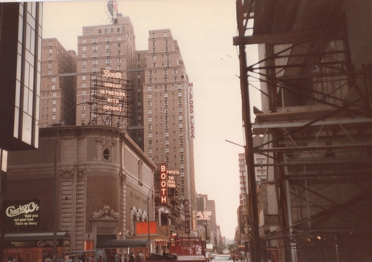
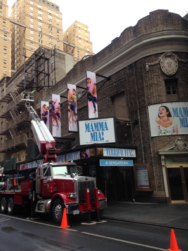
I've been passing the Broadhurst the past couple of weeks to see if there has been any progress or if the load-in doors were open. They happened to be open last week when they were building the deck. I am not familiar with what tracks look like before the floor is down but there appeared to be tracks for the automation of the taverna walls in the deck and yesterday I walked past and the doors were open again and snapped this....
Not the best picture but we can see its not the simple tour set for the Broadhurst.
I also found it interesting they changed the marquee, it was a darker blue last week
Updated On: 1/28/14 at 10:46 AM
#31MAMMA MIA! marquee is up at the Broadhurst
Posted: 10/23/13 at 11:30amSOO happy they are not using the cheap tour set!
"There’s nothing quite like the power and the passion of Broadway music. "
VotePeron
Broadway Legend Joined: 5/2/13
#32MAMMA MIA! marquee is up at the Broadhurst
Posted: 10/23/13 at 11:43amYES! I am really happy they are not doing to the tour set, or the minuscule London set (the one they currently have). Also, good for them for taking this opportunity for new artwork/advertising! Can't wait to see what the giant "Broadhurst" marquee atop the theatre displays, although I bet it will just read "Mamma Mia"

#33MAMMA MIA! marquee is up at the Broadhurst
Posted: 10/23/13 at 12:01pmThe show should just end already. It has been 10-11 years? I think it should just end already

winston89
Broadway Legend Joined: 6/18/06
#34MAMMA MIA! marquee is up at the Broadhurst
Posted: 10/23/13 at 12:04pmI do not get the point in posts that suggest a show that someone doesn't like should close. It's a free market economy and the show is clearly making money. Why stop that process if it's doing well? There's no logical point to those stupid comments.
"If you try to shag my husband while I am still alive, I will shove the art of motorcycle maintenance up your rancid little Cu**. That's a good dear"
Tom Stoppard's Rock N Roll
#35MAMMA MIA! marquee is up at the Broadhurst
Posted: 10/23/13 at 12:06pm
The show should just end already. It has been 10-11 years? I think it should just end already
That's pretty stupid. Why would they close something that is making money? That's like saying a restaurant down the street that you don't like but is doing great business should just close. No logic.
"There’s nothing quite like the power and the passion of Broadway music. "
jemjeb2
Featured Actor Joined: 6/28/05
#36MAMMA MIA! marquee is up at the Broadhurst
Posted: 10/23/13 at 1:37pmYep - almost as "rude and obnoxious" as the snarky posters who constantly yammer about those awful tourists who keep Broadway in business. As if generalizing is ever very accurate.
RippedMan
Broadway Legend Joined: 8/14/05
#37MAMMA MIA! marquee is up at the Broadhurst
Posted: 10/23/13 at 2:05pmI wish they'd deck out the marquee. Get some bright colors up there, etc. Make it feel like a party.
#38MAMMA MIA! marquee is up at the Broadhurst
Posted: 10/23/13 at 3:00pm

I'm sure they'll add more stuff, but I worked across the street at the time and even Les Mis didn't have all this added stuff on the facade until after they were already in previews, possibly even after opening. Give it a little time. The Broadhurst will be in bedazzled glory soon enough!
"Hey little girls, look at all the men in shiny shirts and no wives!" - Jackie Hoffman, Xanadu, 19 Feb 2008
#39MAMMA MIA! marquee is up at the Broadhurst
Posted: 10/23/13 at 3:56pm^ I LOVE when shows go all out on decking out the facade.
"There’s nothing quite like the power and the passion of Broadway music. "
Jonwo
Broadway Legend Joined: 3/16/06
#40MAMMA MIA! marquee is up at the Broadhurst
Posted: 10/23/13 at 10:36pmInteresting that Broadway didn't get the smaller set that The London production got when it moved, I wonder if they'll keep the lift as that might be something they cut to save on running costs,
RippedMan
Broadway Legend Joined: 8/14/05
#41MAMMA MIA! marquee is up at the Broadhurst
Posted: 1/28/14 at 1:40pmWalking by the theater today, they had some trucks outside that said like "Neon lighting company" and the picture at the very top of the theater was taken down. Maybe they're sprucing it up after all? Ticket sales are down, so maybe they're trying to make it look more exciting.
#42MAMMA MIA! marquee is up at the Broadhurst
Posted: 1/28/14 at 2:45pmMamma Mia would look great with a LED sign up on the marquee, that would work.
TheaterBoy7777
Broadway Star Joined: 1/28/06
TheaterBoy7777
Broadway Star Joined: 1/28/06
#45MAMMA MIA! marquee is up at the Broadhurst
Posted: 1/28/14 at 3:25pmI'm still waiting for good power wash
RippedMan
Broadway Legend Joined: 8/14/05
#46MAMMA MIA! marquee is up at the Broadhurst
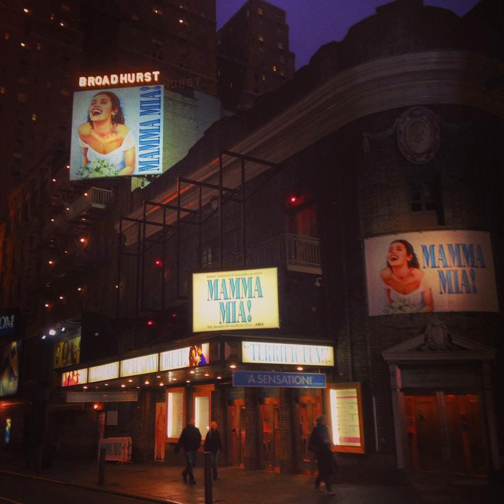
Posted: 1/28/14 at 5:43pmI don't get why they don't update that picture. It's terrible and really dates the show. And showing people in wetsuits is just confusing. Why not put everyone in the Abba outfits or something. They def need to retool.
broadwayguy2
Broadway Legend Joined: 5/18/03
#47MAMMA MIA! marquee is up at the Broadhurst
Posted: 1/28/14 at 6:10pm
The bride was updated a year ago.. New dress and new hair, reflecting the current costume in the show. Its hard to tell in these pictures.
The art outside the theatre also heavily features the leads in the ABBA jumpsuits, but the girls in party clothes and boys in wetsuits reflect the content of the show, so featuring both really IS spot on.
RippedMan
Broadway Legend Joined: 8/14/05
#48MAMMA MIA! marquee is up at the Broadhurst
Posted: 1/28/14 at 6:35pmI suppose. I just find the wet suits look to be a little cheestastic. I mean, for sure, the show is cheesetastic, but I think there's a way to do it that isn't so dated looking with the white background, etc. But maybe not.
#49MAMMA MIA! marquee is up at the Broadhurst
Posted: 1/28/14 at 10:38pm
Brand new after lurking for some time -- hello, all. I'm almost embarrassed that my first post has to do with Mamma Mia! but I like advertising/marketing, so I can deal.
I actually like the brand upgrade. The Sophie makeover was essential. The sky blue, as opposed to navy, against the white reads a bit younger and more fun to me. From what RippedMan said, I wonder how it would look if the logo were up on the top sign in neon.