

Black & white Stage Design?

aces25
Broadway Legend Joined: 1/13/04
#1Black & white Stage Design?
Posted: 8/26/15 at 7:38pm
I'm doing some research and has the design of trying to create a black and white movie on stage ever been attempted?

Tag
Broadway Legend Joined: 11/19/05
AEA AGMA SM
Broadway Legend Joined: 8/13/09
#3Black & white Stage Design?
Posted: 8/26/15 at 7:59pm
City of Angels; everything that was part of the "movie" was in black and white.
kamicokrolock
Chorus Member Joined: 6/18/15
#4Black & white Stage Design?
Posted: 8/26/15 at 8:02pm
It's odd that you ask this. Though not Broadway, the Takarazuka Revue in Japan did something like that in one of their revues I was recently watching. It was a dance number in the review Etoile de Takarazuka. The dancers wore gold, peach and a bit of orange and the stage was lit with a mix of green and blue so that everything including their faces looked like they were in a black and white film. as the scene progresses they change the lighting so that everything gets warmer and more colorful. I thought it was a very nice effect. I'm going to try to include a link to it on Youtube It should start at that part.
If not the video is called: Etoile de TAKARAZUKA (should be the first one that pops up and is over an hour long), and the part you"d want starts at 39:32 .
Updated On: 8/26/15 at 08:02 PM
Smaxie
Broadway Legend Joined: 9/26/05
#5Black & white Stage Design?
Posted: 8/26/15 at 8:39pm
The 1977 production of Dracula had a spectacular black and white set by Edward Gorey. Not sure that a photo does it justice, but it was something to see.

Begin at the beginning and go on till you come to the end: then stop.

#6Black & white Stage Design?
Posted: 8/26/15 at 9:53pm
Didn't the Dracula design also have very small bits of red here and there? Someone would have brilliant red lipstick, or be holding a vivid red glass of wine, and then when Dracula opened his cape it was revealed to be lined entirely with bright red fabric. Or something like that.
Smaxie
Broadway Legend Joined: 9/26/05
#7Black & white Stage Design?
Posted: 8/26/15 at 10:03pm
Yes, each act had an item that was red. I don't remember specifically what they were, but I remember the conceit.
Begin at the beginning and go on till you come to the end: then stop.
#8Black & white Stage Design?
Posted: 8/26/15 at 10:10pm
Yes, absolutely, Charlie! There was one bit of red in each B&W scene: I remember the wine glass. It seems to me there was also a red rose in a bedroom scene and a trickle of red blood on a woman's neck in another scene. Perhaps the most beautiful set I've ever seen for a straight play.
I directed a production of Ira Levin's DR. COOK'S GARDEN at the Apple Corps Theatre in about 1984. Since the play had originally been written as an episode of Playhouse 90 or one of those 1950s anthology shows and had a sort of TWILIGHT ZONE feel about it, I thought it would be cool to do it all in B&W.
It is VERY difficult, especially with the budget of a small off-Broadway theater. Some greys tend to "go blue" (i.e., look almost violet) while others "go green" (tend to look olive). Depending on the ambient lighting, it's not always easy to tell which you've got and we spent the entire rehearsal period returning set pieces and props to get our greys to match.
And then you add lights and the problem of colored gels.
All of which made the accomplishment of the DRACULA set even more impressive.
A Director
Broadway Legend Joined: 12/18/07
#9Black & white Stage Design?
Posted: 8/27/15 at 1:00am
In the original production of Kiss Me, Kate, there was a black and white drop or set in one scene. The sets and costumes were designed by Lemuel Ayers. Hal Prince wrote about asking Ayers about the set. He assumed the set really was black and white. Ayers showed Prince a rendering. Prince was surprised there was no black and white. Ayers had used colors that fooled the audience into thinking the set was black and white.
I saw Dracula and the design was stunning to see. In each scene there was a touch of red: a rose, wine and a red diamond on a dress.
Years ago, I saw a production of George M. Cohan's Seven Keys to Baldpate. The design was inspired by 1930s movies. The set, costumes, props and make-up were all black and white.
Rinaldo
Understudy Joined: 5/5/09
#10Black & white Stage Design?
Posted: 8/27/15 at 6:24pm
Just one scene, but the Ascot scene in MY FAIR LADY was designed by Oliver Smith and Cecil Beaton in black and white.
Christopher Durang's play-with-music HISTORY OF THE AMERICAN FILM is structured just as the title says, but with continuing characters as a comment on American ideals and assumptions. All of Act I is in black and white (and the first few minutes are silent, with subtitles), and then when WWII starts just before the Act I finale everything goes into color.

#11Black & white Stage Design?
Posted: 8/27/15 at 6:38pm
There was a small red pin on Lucy's blouse, a red glass of wine, red roses, the lining of Dracula's cape. Each sceen the red increased. The show ended with a very red sunrise.
Those Blocked: SueStorm. N2N Nate. Good riddence to stupid! Rad-Z, shill begone!
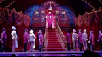
#12Black & white Stage Design?
Posted: 8/27/15 at 7:56pm
The West End Production of The Wizard of Oz recreated the brown color for the beginning... I will try to find a pic!
Update: You can see it a once or twice in this video!
https://www.youtube.com/watch?v=H5EIZSX9rBA
Updated On: 8/27/15 at 07:56 PM
Cape Twirl of Doom
Broadway Legend Joined: 11/2/05
#13Black & white Stage Design?
Posted: 8/27/15 at 8:36pm
I saw STRANGERS ON A TRAIN in the West End two years ago and they had a monochromatic color scheme in the costume & set design to try and replicate the film.
Here are some pics:


"It's Phantom meets Hamlet... Phamlet!"