

Most Creative Logo For a Musical
thevolleyballer
Broadway Legend Joined: 9/29/04

#26re: Most Creative Logo For a Musical
Posted: 7/2/06 at 4:28pmA Little Night Music's with the nude lovers in the tree branches. So creative and beautiful.
Variations on a Theme blog: http://panekattack.blogspot.com/
ActingAndy
Stand-by Joined: 6/20/06
#27re: Most Creative Logo For a Musical
Posted: 7/2/06 at 4:41pmi really like AIDA... the two faces together...
Stand-by Joined: 12/31/69
#28re: Most Creative Logo For a Musical
Posted: 7/2/06 at 4:48pm
![]()
I love how HAIRSPRAY's shows it 60's element of the show and fun. And of course Tracy's pretty face.
and I love All Shook Up's cartoony and fun poster and how represnts the crazy and chatoic fun of the show.
Updated On: 7/2/06 at 04:48 PM
Jon
Broadway Legend Joined: 2/20/04
#29re: Most Creative Logo For a Musical
Posted: 7/2/06 at 5:49pm
The Keith Haering (sp.?) logo for FALSETTOS was great.
The original SWEENEY TODD logo is quite memorable.
Here's an oldie but a goodie: The original MY FAIR LADY, with Henry Higgins as a puppeteer pulling Eliza's strings, while from above, God (or George Bernard Shaw)contols Higgins' strings.

#30re: Most Creative Logo For a Musical
Posted: 7/2/06 at 6:04pmSticking to the topic, which is the most CREATIVE logo, I would have to say Miss Saigon.
#31re: Most Creative Logo For a Musical
Posted: 7/2/06 at 6:49pm

I'm pretty smitten with this gorgeous logo/poster design:

coolphantom919
Broadway Star Joined: 6/6/06


MissElphie
Broadway Star Joined: 4/4/05
#33re: Most Creative Logo For a Musical
Posted: 7/3/06 at 1:20pmI love the Wicked logo. It has been my favorite since I first saw it.

#34re: Most Creative Logo For a Musical
Posted: 7/3/06 at 1:34pmi agree, i love the Sweeney one. it was just very well done.

#35re: Most Creative Logo For a Musical
Posted: 7/3/06 at 1:37pm
I always thought the Seussical logo and publicity photos were very creative. It's like all of the Dr. Seuss characters taking over New York City. I loved it!!!
"I believe that art does not exist only to entertain, but also to challenge one to think, to provoke, even to disturb, to engage in a constant search for the truth."
- Barbra Streisand
Updated On: 7/23/06 at 01:37 PM
#36re: Most Creative Logo For a Musical
Posted: 7/3/06 at 3:01pmi loved "passion". so simple, but perfect!
#37re: Most Creative Logo For a Musical
Posted: 7/3/06 at 3:06pm
I love the 'Wicked' logo. Visually, it's such a great show. I also love 'Miss Saigon' so much more since that thread pointing out there was a face as well as a helicopter. It's a very well done logo. ^_^

#38re: Most Creative Logo For a Musical
Posted: 7/3/06 at 3:16pmI particularly enjoy the original logo of 1776. With the Eagle bursting from the egg with the American Flag in it's beak.
"Love the Art in Yourself. Not Yourself in the Art." -- Stanislavski
theatajunkee
Swing Joined: 8/7/05
#39re: Most Creative Logo For a Musical
Posted: 7/3/06 at 3:48pm
my favorite is the newest Oliver revival.... with the face.
its genious.
Thats showbiz, kid
BwayBaby18
Broadway Legend Joined: 2/19/05
#40re: Most Creative Logo For a Musical
Posted: 7/3/06 at 4:19pm
Jekyll and Hyde is sooooooooooooo sexy
Updated On: 7/3/06 at 04:19 PM
Wildcard
Broadway Legend Joined: 6/21/06
#41re: Most Creative Logo For a Musical
Posted: 7/3/06 at 4:21pmI think the Cats logo is very creative, simple yet elegant and reflective of what the show was... a dance musical. I like the Miss Saigon logo too but not the helicopter part. I like the logo in type with the sun behind the "i". These logos were what made me want to become a designer which I am now.
Beanmatt
Chorus Member Joined: 5/16/03
#42re: Most Creative Logo For a Musical
Posted: 7/23/06 at 6:10pm
I know there has been tons of talk on here about logos so I dug up this older thread to post on it. I was looking at the WICKED logo today and noticed something fairly obvious that I had just never noticed before, and wondered if others had caught this as well.
- The Elphaba figure has red lips, something the actual character wouldn't.
- The Glinda character has green in her eye(s).
I saw this and thought how clever! Representing how two very different people have a litle bit of each other in them (or how they end up effecting each others lives, etc).
Am I the only one who never noticed this before?
morosco
Broadway Legend Joined: 7/10/04
#43re: Most Creative Logo For a Musical
Posted: 7/23/06 at 6:16pm

I always like the poster for THE RINK. Not really a logo but very creative.
#44re: Most Creative Logo For a Musical
Posted: 7/23/06 at 6:21pm
I am also a fan of the Rent Logo, the older one at least not the Rent Live. It was catchy with the "No Day But Today" - I also like well what I think is catchy...
WICKED...so much happened before dorothy dropped in
Wedding Singer - get ready to party like its 1985.
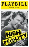
I made a list of all your faults, it was quite detailed and lengthy too and when I read it through I missed you. Your like a classic Eagles song, you just cant help but sing along even though it sometimes gets annoying too. I just know I want to be wherever I can wake and see you there next to me. **High Fidelity**
Love is what I do **The Wedding Singer**
Xanadu - Best NEW Musical of the Season!
SDav 10495
Broadway Star Joined: 7/21/06
#45re: Most Creative Logo For a Musical
Posted: 7/23/06 at 6:23pm
Oh yeah, I'd forgotten about Wicked. It's not a favorite show of mine, but I've always really liked the poster design--it was so iconic from the start, they practically own that shade of green now. I hate what they've done to it for the West End.
The original Sweeney logo was great--there's something really tounge-in-cheek yet really unsettling about those figures--but I really don't like the new graphic design. Sure, you're walking down the street and you glance at that color blue and you know it's a Sweeney poster, so I suppose it's successful in that sense. But there's something about that color and the mettalic letters and the eyes in the razor that seems too overdone for such a minimalist production. They should have gone with something darker and more to-the-point in keeping with the new staging. (Plus, the font they use for the reviewers' quotes on their posters is really, really ugly and doesn't fit at all...a classic show like Sweeney deserves something less generic.)
"If there is going to be a restoration fee, there should also be a Renaissance fee, a Middle Ages fee and a Dark Ages fee. Someone must have men in the back room making up names, euphemisms for profit."
(Emanuel Azenberg)
Updated On: 7/23/06 at 06:23 PM
froggy2
Featured Actor Joined: 7/16/06
#46re: Most Creative Logo For a Musical
Posted: 7/23/06 at 6:27pmSee What I Wanna See - there's so much going on in that one.

#47re: Most Creative Logo For a Musical
Posted: 7/23/06 at 6:31pmDoes anyone else think that the Aida logo and the Wicked logo are simular?

#48re: Most Creative Logo For a Musical
Posted: 7/23/06 at 6:35pm
Strictly going by creativity of logos...
Clumsy - I hate to say it, I really do (because we all know I'm as big an ASU fan as you) but I really don't think that there's nothing "most creative" about ASU's logo. =(
I am NOT a fan CATS but theirs is excellent, as is Miss Saigon (after I was shown the helicopter/face, haha). Wicked, yes, has excellent eye-appeal, but I'm not sure it falls under most creative. I also think the London logo loses some of that eye-appeal. Falling under the "eye-appeal" umbrella, for me personally, is not the logo per se of Piazza but the cd cover, with the golden-yellow background and Clara silhouetted. Ahhh.
Broadway Star Joined: 12/31/69
#49re: Most Creative Logo For a Musical
Posted: 7/23/06 at 7:15pm
Most CREATIVE? Cats. Although I hated the musical, the logo was very striking. Also, I think, See What I Wanna See.
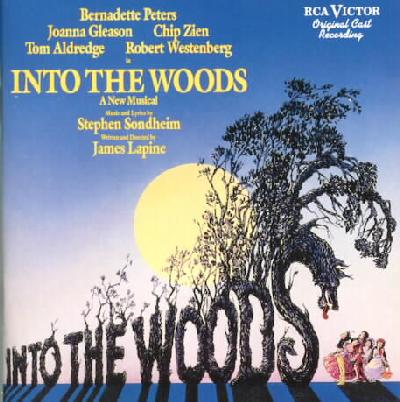
My favorites: Rent (the original one- not the one they have now, where it looks like myspace threw up), Jekyll and Hyde, and Into the Woods.