

BWW Blog: Day in the Life of a Publicity Officer- Posters
Welcome to the second installment of 'Day in the Life of a Publicity Officer'. As mentioned in my previous article, I have many responsibilities. Not only do I make video newsletters, but I create posters as well. Facebook covers, event covers, flyers, etc. Next week is Shakespeare Week, meaning we have a jam-packed week ahead with awesome events. Also meaning I'm in the library trying to get the poster done as soon as possible. In this article, I'm going to show how I create a poster and hopefully provide some insight on how you can too.
First thing's first, how in the world do I create this? What software do I use? What website do I use? Do I have to pay for something? Can I create it for free? Is there a website to get a software free off of? So many questions. I've heard people use so many different things too like PowerPoint or Photoshop. Those are so complicated though! Also, expensive if you don't have them already. So how can I, as an amateur, create an excellent poster in the simplest way possible? Easy. Canva. Never heard of it? Canva.com is the simplest way to create posters I know. As stated online "Canva is a free graphic-design tool website, founded in 2012. It uses a drag-and-drop format and provides access to over a million photographs, graphics, and fonts. It is used by non-designers as well as professionals." You can have zero experience in graphic design and still be able to make the best posters in the world. Any type of poster you want to create, you can do it with Canva.
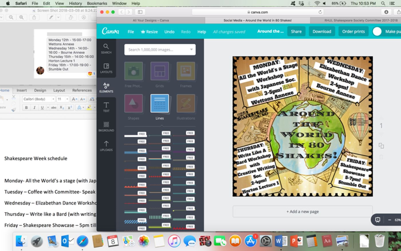
Okay so now that there's a website I can use, how do I actually come up with a poster? Well, got to make sure you have all the information you need before anything else. Names, times, and locations are always necessary. Otherwise your readers won't know where to go, when it is, and what it is...which is obviously crucial. Once you got that, you need to find a background to use. The theme of Shakespeare Week is 'Around the World in 80 Shakes!' So, I used an animated picture of the world to represent that. Always recommend using an animation, or drawing, as the background instead of a real picture. That way it draws more attention to the information, instead of what's behind it.
Another very important thing is fonts and colors. If I'm doing a Halloween poster for example, I'd use the "Creepster" font in a red color. That way it pops out more to the reader and goes smoothly with the theme. If the color blends in with the background too much and you really want to use it, another trick is to add white or black lines behind the text as I did for the Shakespeare Week poster. That way it's readable, and you can still use the color of your choice.
Finally, my best advice is to add a frame to your texts and poster like I did as well. It's a great addition to make everything pop and bring it all together. Hope you have fun creating posters, and till next time xx
|
Saturday Comedy Club London | Covent Garden, July 2026 Comedy Carnival Covent Garden (7/25-7/25) |
|
Kick the Door Down Theatreship (9/25-9/25) |
|
Michael Spicer - Hope All''s Well Manchester Fairfield Social Club (11/19-11/19) |
|
Disney''s Muppet Christmas Carol in Concert Royal Concert Hall Nottingham (12/04-12/04) |
|
Disney Princess - The Concert Opera House, Manchester (4/04-4/04) |
|
Back to the Future The Musical Liverpool Empire Theatre (1/12-2/06) |
|
PURE REASON REVOLUTION at O2 Academy - Liverpool O2 Academy Liverpool (11/05-11/05) |
|
Trainspotting The Musical: Arches Bar Champagne Experience Sheffield City Hall Oval Hall (10/30-10/31) |
|
|
Trainspotting The Musical Brighton Dome (3/09-3/13) |
|
Orchestral Qawwali Project The Royal Albert Hall (10/24-10/24) |