

Disney's Little Mermaid bluray editing blunder

#1Disney's Little Mermaid bluray editing blunder
Posted: 8/22/13 at 2:26am
Disney's upcoming Blu-Ray release of The Little Mermaid has made some odd editing alterations to the original, nearly 25 year old, classic film.
1. The "Walt Disney Pictures Presents" title has been placed over a different shot for some reason. Before it was over the shot of the coral, now it's been moved to this.. 
2. The cross fade into the Skuttle scene is now a quick "cut to" 
Okay, those aren't really big deals, but this next one...
3. The end of the "Part of Your World" musical sequence has had two different shots reversed. The shot of Flounder sighing has always followed the shot of Ariel floating down to her rock. Now Flounder is first and the the descending Ariel abruptly cuts to her already sitting. 
How is it that a mistake like this gets overlooked in a "restoration"?
Disney has had quite a controversial reputation as it is with their restorations on blu-ray & dvd. There is much debate about colors being altered for Beauty and the Beast (debatable if for the worse), Animation of rolling clouds completely missing on the blu-ray release of The Lion King where Simba chases after Mufasa's spirit. Repainting over intricate details in Cinderella sloppily to try and remove (the now demonized in the home entertainment industry) film grain, The recent release of Sword in the Stone uses so much DNR that the film is a blurred mess, etc, etc, etc.
I was annoyed at some of these mistakes, and hardly noticed others...but The Little Mermaid...I don't think I can be cool with them messing with this. Even if it's such a quick passing mistake, I'll know it's there and will possibly ruin the enjoyment, especially during Part of Your World.
Am I overreacting? Probably. These are things only someone who's watched a movie an unhealthy amount of times would even notice, but I am what I am, and about this I'm a little pissed. At what point do fans of these films have an argument against needless alterations being made by a restoration team?
EDITED TO ADD:
Disney is now offering replacement discs. You can contact them at the numbers below
http://www.disneystudioshelp.com/ContactUs
800-723-4763 (U.S.)
888-877-2843 (Canada)
Updated On: 10/3/13 at 02:26 AM

#2Disney's Little Mermaid bluray editing blunder
Posted: 8/22/13 at 7:11am
I don't think you are over-reacting. I am an avid film buff and like you I notice stuff like this and when stuff like this is done it ticks me off as well. If ain't broke don't fix it.
The re-called blu-ray of WEST SIDE STORY had a jarring 2 second fade to black before the title card reveal. There was no fade to black in the original. Atrocious. It was re-called and it was fixed for the most part but that flawed print is the one that TCM now airs.
I am hoping and praying none of these "restoration fixes" crop up on the upcoming MARY POPPINS release or I will be crying bloody murder!
#2Disney's Little Mermaid bluray editing blunder
Posted: 8/22/13 at 8:38am
On this youtube clip they show the missing effects animation on the blu-ray for The Lion King.
at 12 seconds in you see the way it is supposed to look, and at 36 seconds in you see the exact same shot with the missing effects on the blu-ray release.
Disney has yet to even acknowledge all the complaints and requests for a replacement disc. I doubt they will bother with Mermaid.
The Lion King missing cloud comparison

#3Disney's Little Mermaid bluray editing blunder
Posted: 8/22/13 at 9:12am
Well, they're not going to replace the discs because they don't consider this a "glitch" or a "mistake." It was a conscious decision to alter the shot.
I'm already wary of all classic Disney Blu-ray releases. They have changed quite a lot over these past few years when they rescanned all of their animated films and computer-generated the color, frame by frame.
They lost a lot of the hand-drawn "human" quality in the name of flawless color with no bleed, dust, scratches, or brush stroke marks in the inking. Along the way, they also decided to change some of the colors.
I try not to nitpick when I watch them, and worry about what shade of blue they used for the circus performers uniforms in Dumbo (a huge change though from a light blue-gray to a navy blue).
I usually go by how I feel when I watch them. And in some respects the charm has been lost on several of them. They are too sanitized, too cleaned-up, too flat, and way too vibrantly colored. Disney was SO aware of color choices and subtle hues, especially in their early days of animation.
Thankfully, Disney started out on the right foot with their first Blu-ray releases. I think Sleeping Beauty is fantastic (even with some subtle changes). Snow White and Bambi look very good too.
Then they started to go too far with it: Pinocchio got such bad reviews as a "revisionist" disc that I didn't even buy it. I saw the shots of Stromboli's shirt, changing from an off-white color with hints of green and gray, to a lime green shirt, and I said "forget it."
I did buy Fantasia, and that's where I talk about how I "felt" when I watched it. It wasn't the same experience. Yes, I was already prepared that Deems Taylor's voice as the narrator was completely re-dubbed by a voice actor, who doesn't even sound like Mr. Taylor. A lot of people say it doesn't matter, but Deems Taylor was a famous commentator and critic of classical music back in the day, and his voice was well-known by everyone with a radio in the '30s and '40s. So it's not like overdubbing "some guy" who hosted Fantasia, it's like overdubbing other famous voices we know and love today and replacing it with someone who doesn't match.
Then I got to the Pastoral Symphony, and the colors were so bright and candy-like that I kept thinking something was wrong. Finally, my favorite segment: Night on Bald Mountain. Everything is in rich shades of blue now. The devil on the tower, the mountain, the ghosts coming out of the graves. As a kid, I remember the cold shades of gray and black. The lack of color. It was chilling. Now it's all rich blues. The coldness is gone, and so is the icy feeling you get while you watch it. That's when the "improvements" go too far. Beyond "fixing" or embellishing. They have changed the mood of the movie. That's like rewriting the script, to me. And Walt Disney, with his obsession about color choices and color palettes, would have had a fit if he'd seen it.
I bought a few more Blu-rays, Lady and the Tramp, Beauty and the Beast, and Peter Pan. All look stunningly clear, and all feel "off" to me. They have a modern slick look and a vivid color palette (too vivid) that fight with my memory of how they looked in the theatres when they were released or re-released, and even how they look on my original DVDs, which I've kept.
So I didn't buy Cinderella, Alice In Wonderland (one of my favorites), Dumbo, The Aristocats, The Rescuers, etc. I'll stick with my low-def copies. They may not be crystal clear, but they look more like the films I remember seeing, growing up.
"Jaws is the Citizen Kane of movies."
blocked: logan2, Diamonds3, Hamilton22
Updated On: 8/22/13 at 09:12 AM
blocked: logan2, Diamonds3, Hamilton22
#4Disney's Little Mermaid bluray editing blunder
Posted: 8/22/13 at 9:27am
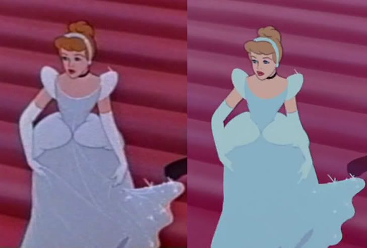
Cinderella took the cake in butchered restorations. This restoration actually goes back to the platinum edition dvd, sadly there is no official DVD release of the correct film. The screenshot below is the laserdisc vs. dvd/blu-ray.
and then there is The Sword in the Stone DNR nightmare...

#5Disney's Little Mermaid bluray editing blunder
Posted: 8/22/13 at 9:29am
Yeah, the DNR (digital noise reduction) on the recent Blu-ray of Sword in the Stone is appalling.
I've seen critics give the video quality a rating of "one star" (the lowest).
Here's a good Pinocchio comparison, which was the first one I skipped buying:
LINK
"Jaws is the Citizen Kane of movies."
blocked: logan2, Diamonds3, Hamilton22
Updated On: 8/22/13 at 09:29 AM
blocked: logan2, Diamonds3, Hamilton22
#6Disney's Little Mermaid bluray editing blunder
Posted: 8/22/13 at 9:56am
Here's another example of going way too far. Alice In Wonderland.
Check out the huge shift in the color of the sky. Also the bright yellow change for Alice's hair.
LINK
"Jaws is the Citizen Kane of movies."
blocked: logan2, Diamonds3, Hamilton22
blocked: logan2, Diamonds3, Hamilton22
#7Disney's Little Mermaid bluray editing blunder
Posted: 8/22/13 at 10:04amYeah, I remember how jarring it was the first time Alice showed up on screen with school bus orange-yellow hair instead of her traditional light blonde. Ugh.
#8Disney's Little Mermaid bluray editing blunder
Posted: 8/22/13 at 10:51am
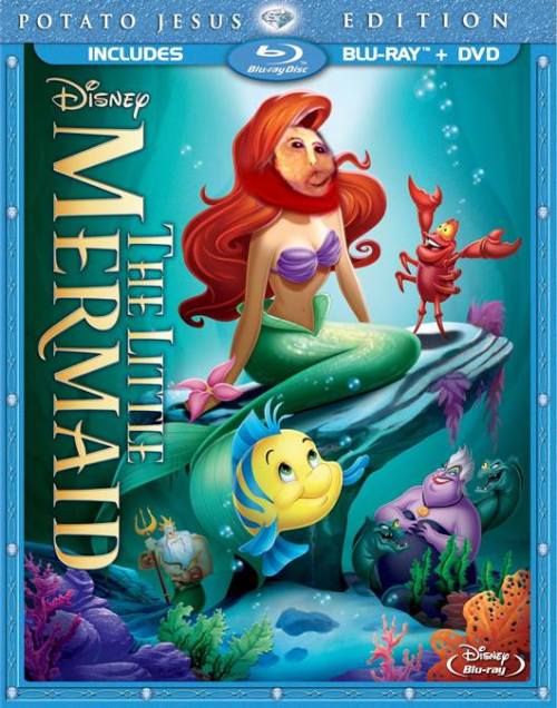
A more fitting cover for the blu-ray...

TheatreDiva90016
Broadway Legend Joined: 4/10/04
#9Disney's Little Mermaid bluray editing blunder
Posted: 8/22/13 at 10:55amThat is hysterical!
"TheatreDiva90016 - another good reason to frequent these boards less."<<>>
“I hesitate to give this line of discussion the validation it so desperately craves by perpetuating it, but the light from logic is getting further and further away with your every successive post.” <<>>
-whatever2

#10Disney's Little Mermaid bluray editing blunder
Posted: 8/22/13 at 11:18am
Brilliant re-touching there.
The more I see examples of this, the more grateful I am for Criterion, and the National Film Registry, and groups that actually care about film restoration and preservation as an art and an important cultural legacy.
Words don't deserve that kind of malarkey. They're innocent, neutral, precise, standing for this, describing that, meaning the other, so if you look after them you can build bridges across incomprehension and chaos. But when they get their corners knocked off, they're no good anymore…I don't think writers are sacred, but words are. They deserve respect. If you get the right ones in the right order, you can nudge the world a little.

millie_dillmount
Broadway Legend Joined: 4/22/04
#11Disney's Little Mermaid bluray editing blunder
Posted: 8/22/13 at 11:26amYou guys have a good eye. I would have not noticed these things. Very interesting.
"We like to snark around here. Sometimes we actually talk about theater...but we try not to let that get in our way." - dramamama611
beautywickedlover
Broadway Legend Joined: 6/28/07
#12Disney's Little Mermaid bluray editing blunder
Posted: 8/22/13 at 11:38am
This is apparently the reason why Disney made Cinderella's dress blue:
"One of my friends at Disney told me this one. This change occurred in the early 90's due to the artists who make the promotional posters, vhs covers, etc. They wanted to advertise Cinderella in her iconic ballgown surrounded by streams of sparkly magic (rather than rags)...however in the original silver color, the dress and sparkles blended into one another. So these artists added the darker blue tint to the dress in order to add contrast. It has remained so ever since."
http://www.fanpop.com/clubs/disney-princess/answers/show/19181/why-cinderellas-dress-always-portrayed-blue-when-white-movie
And because she has blonde hair and wears blue that is probably the main reason why Aurora, 'Sleeping Beauty', is always advertised with a pink dress so she she will not be confused for Cinderella. Aurora often wears pink in the American Disney parks though she is seen wearing blue at Disneyland Paris because people there don't confuse her for Cinderella.
#13Disney's Little Mermaid bluray editing blunder
Posted: 8/22/13 at 2:00pmChanging the color of the dress is one thing, but if you look at that image I posted, the painted over all line detail in her dress. It's now just a big blue blob. An old laserdisc has more line detail than a 2012 Blu-Ray...that just ain't right.
#14Disney's Little Mermaid bluray editing blunder
Posted: 8/22/13 at 5:03pm
JohnyBroadway
Broadway Legend Joined: 4/10/12
#15Disney's Little Mermaid bluray editing blunder
Posted: 8/22/13 at 5:16pmI believe for beauty and the beast an cogs worth sequence was reanimated, too.

#16Disney's Little Mermaid bluray editing blunder
Posted: 8/22/13 at 6:39pm
The POYW change appears to be a mistake, so I expect a recall to fix that-- especially considering the outcry already raised a little more than a month before street date.
A real pity, too. Mermaid is my favorite DAC, and up until now, it's alterations had been comparably minor next to BATB or Aladdin, for instance. Even the restoration looks very faithful. But you can't screw with POYW, and I don't think they're going to get away with it.

#17Disney's Little Mermaid bluray editing blunder
Posted: 8/22/13 at 7:00pm
The Sword in the Stone blu-ray looks like someone just ran it through a bad photoshop filter. The color for the Cinderella DVD looks less vibrant, but more detailed than the blu-ray.
I don't really understand the process for "restoring" animated movies that were not originally made for today's high definition technology. For the most part it just looks like they're reanimating and completely destroying the original artists' work.
Updated On: 8/22/13 at 07:00 PM
#18Disney's Little Mermaid bluray editing blunder
Posted: 8/22/13 at 7:39pm
In a way you're right, CATS.
Those hand-painted cels were photographed individually for the original analog films. They are essentially standard "footage," just like a classic live action movie.
So the studio is now scanning each frame into a computer, and instead of just cleaning up the dust and dirt and adjusting the color from the original camera negatives (the way you would with live action), they are re-drwaing the line art to some degree, and then re-inking each frame digitally with "computer colors" replacing hand-painted ink.
I would be okay with it if they wouldn't decide to make "improvements" over the original by changing colors. They aren't just restoring it, they're altering it.
That's where they need to seriously reconsider. For me, the look of these new Blu-ray Discs is colder, less "human," more "technical." Seeing a bit of an ink blemish or a line that wan't exactly perfect is what made these movies come alive, IMO. Just like when you see the uneven brush strokes up close on a masterwork painting. You don't want it all to be perfectly even and flat. Up close, you can see the long hours and perspiration that went into it.
I think it is a major step down in what Walt and his brilliant team of artists created 70 and 80 years ago. It's sad to me.
Maybe for younger kids, they won't know the difference. To a degree, it makes these "old" films look more modern and possibly more accessible to new generations. It removes the age. They might look at those old flaws and consider them sloppy or "bad" animation. That also makes me sad.
"Jaws is the Citizen Kane of movies."
blocked: logan2, Diamonds3, Hamilton22
blocked: logan2, Diamonds3, Hamilton22

#19Disney's Little Mermaid bluray editing blunder
Posted: 8/22/13 at 8:22pm
Wow, never realized how close that song is to Somewhere that's Green!
ETA: in some cases like Pinocchio, I like the darkening and change of tones in the remasterings. I always thought that it was a very dark tale. with a happy ending.
Those Blocked: SueStorm. N2N Nate. Good riddence to stupid! Rad-Z, shill begone!
Updated On: 8/22/13 at 08:22 PM
#20Disney's Little Mermaid bluray editing blunder
Posted: 8/22/13 at 9:11pm
I don't actually think they've darkened it. They dulled it down and flattened the colors. But they also removed the grit (look at the pavement and the walls). Pinocchio used to have sort of a "burnt" or grimy look that went so well with the darker themes and orchestral score. It served the drama well.
All I think they've done is make it more even and dim. And cleaner.
Not darker at all.
And by "darker" I mean more sinister, not just lower light.
But to each his own.
"Jaws is the Citizen Kane of movies."
blocked: logan2, Diamonds3, Hamilton22
Updated On: 8/22/13 at 09:11 PM
blocked: logan2, Diamonds3, Hamilton22
#21Disney's Little Mermaid bluray editing blunder
Posted: 9/13/13 at 9:44am
Disney's response to the issue...
_________________________________________________
"Thank you for contacting Walt Disney Studios.
In preparation for its Blu-ray release, THE LITTLE MERMAID went through an intensive re-mastering process. Unfortunately, a minor oversight led to a switch of two small cuts during the "Part of Your World" scene. There is no impact on the quality or overall experience of the film.
We hope this provides you with the information you require. However, if you require any further information then please do not hesitate to contact us.
Kind regards,
Disney Consumer Relations"
_______________________________________________
They admit this is an error, but not one worthy of a replacement disc? I'd say I'll hold out till the next release of Mermaid in 5 years, but God only knows what will be further altered in that version. Guess I'm hanging onto my DVDs for a while longer.
Updated On: 9/13/13 at 09:44 AM
#22Disney's Little Mermaid bluray editing blunder
Posted: 9/13/13 at 10:07am
There is no impact on the quality or overall experience of the film.
Nice. They're negating the consumer's opinion, and telling viewers in advance what their "experience" will be. There is "no impact." That's really kind of asshole-ish of them.
They should not presume to tell me or anyone else what my "experience" watching their revisionist disc will be.
"Jaws is the Citizen Kane of movies."
blocked: logan2, Diamonds3, Hamilton22
blocked: logan2, Diamonds3, Hamilton22
#23Disney's Little Mermaid bluray editing blunder
Posted: 9/13/13 at 2:36pm
Exactly. It's such a tactless response.
Translation:
"Yes, we screwed up part of the climax of an iconic and emotional moment in the movie, but it doesn't effect the (revenue) quality overall for us, so please, f*** off. We hope this provides you with the means to stop bothering us at consumer relations when we care not for the desires of loyal fans who have cherished this movie for nearly 25 years. Have a magical day!."
beautywickedlover
Broadway Legend Joined: 6/28/07
#24Disney's Little Mermaid bluray editing blunder
Posted: 9/14/13 at 7:55pm
That was so typical of them to say that about 'The Little Mermaid error.
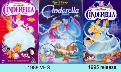
Here is a comparison of the 1995 'Cinderella' VHS to the 2012 Blu-Ray

This reviewer gave the Blu-ray's quality 4 and 1/2 stars.
"Cinderella, like many other Golden Age Disney animated classics that have come to Blu-ray, arrives with a stunning 1080p/AVC MPEG-4 video transfer free of encoding imperfections or, really, any major preservation or restoration flaws to point to. Major being the key word. Much like other Disney animated presentations before it, grain has been removed from the image in the pursuit of a different kind of perfection; carefully, judiciously and without any debilitating injury to the original animation, yes, but removed all the same.
Soft pastel hues, rich primaries, gorgeous blues, lush greens and inky blacks come together to embrace a truly enchanting image, full of life and color. Contrast is dialed in vividly and consistently, and substantial flickering or fluctuations aren't in play. The animation hasn't been severely impacted by the restoration either, minus the thin, brightly hued line art that's been lost or subdued in equally bright blue or white swaths of color. Every line is clean (although often only as sharp as the source elements allow), every color fill is stable, every hand-painted background retains its bristled brush texturing, and significant ringing, aliasing and other such eyesores don't creep into the image. There also isn't any notable print damage or blemishes, artifacting or banding, or more detrimental issues. If I didn't have to address the complete absence of grain (and some of the aforementioned alterations, minor as each one arguably is), this would in fact be the easiest video analysis I've written all year. Purists, particularly those poring over screenshot comparisons, won't be quite so impressed, but most everyone else will be completely satisfied when they see Cinderella's Diamond Edition makeover. Your opinion will mostly be dictated by the camp you call home."
http://www.blu-ray.com/movies/Cinderella-Blu-ray/7650/
Videos