
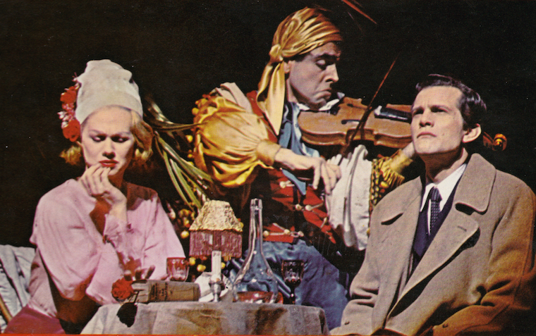
SHE LOVES ME revival design's (first) title treatment

jacobsnchz14
Broadway Legend Joined: 12/13/06
#1SHE LOVES ME revival design's (first) title treatment
Posted: 12/4/15 at 4:29pm
 Photo Credit: http://www.roundabouttheatre.org/Shows-Events/She-Loves-Me.aspx
Fantod
Broadway Legend Joined: 10/3/14
#3SHE LOVES ME revival design's (first) title treatment
Posted: 12/4/15 at 4:39pm
I'm going to go out on a limb and say that's a placeholder until the regular art work is ready to go.
At least I hope so.

#4SHE LOVES ME revival design's (first) title treatment
Posted: 12/4/15 at 4:41pm
Is that something they do often? Use placeholder designs? I haven't found that to be true but maybe I haven't been paying close attention.
But yeah, that's pretty nasty. One of the instances where I find myself hoping the Playbill is in black and white.

#5SHE LOVES ME revival design's (first) title treatment
Posted: 12/4/15 at 4:43pm
They've already been using a placeholder.


#6SHE LOVES ME revival design's (first) title treatment
Posted: 12/4/15 at 5:47pm
OTTC had at least two designs before coming out with the (great) one they eventually used.
BroadwayConcierge
Broadway Legend Joined: 7/24/15
#7SHE LOVES ME revival design's (first) title treatment
Posted: 12/4/15 at 5:59pm
JBroadway said: "But yeah, that's pretty nasty. One of the instances where I find myself hoping the Playbill is in black and white."
Correct me if I'm wrong, but I think all Roundabout shows are black and white playbills?
But yeah, this ain't great. Hoping it will change.
woeisme3
Featured Actor Joined: 9/14/15
#8SHE LOVES ME revival design's (first) title treatment
Posted: 12/4/15 at 6:07pm
I think/hope this is a placeholder, considering the multiple awful designs that On The Twentieth Century went through before settling on the one that they used.
I don't know why Roundabout's art work is going so downhill, though. I loved the artwork for Anything Goes, The Mystery of Edwin Drood, and Violet but these are just so gaudy.
#9SHE LOVES ME revival design's (first) title treatment
Posted: 12/4/15 at 6:19pm
I don'y hate it but its a bit too bubblegum for me.
Keeping BroadwayWorld Illustrated
TerrenceIsTheMann
Broadway Star Joined: 9/28/15
#10SHE LOVES ME revival design's (first) title treatment
Posted: 12/4/15 at 6:22pm
Roundabout Playbills are all B&W.
#11SHE LOVES ME revival design's (first) title treatment
Posted: 12/4/15 at 7:17pm
Awful in it's blandness.
....but the world goes 'round
#12SHE LOVES ME revival design's (first) title treatment
Posted: 12/4/15 at 7:25pm
The little heart above the M is cute!
They/them.
"Get up the nerve to be all you deserve to be."
#13SHE LOVES ME revival design's (first) title treatment
Posted: 12/4/15 at 8:36pm
Is this the version of SHE LOVES ME where the falling comet destroys the parfumerie?
TerrenceIsTheMann
Broadway Star Joined: 9/28/15
#14SHE LOVES ME revival design's (first) title treatment
Posted: 12/4/15 at 8:40pm
I wonder if this show's cast will ever be finalized.

#15SHE LOVES ME revival design's (first) title treatment
Posted: 12/4/15 at 9:43pm
gleek4114 said: "OTTC had at least two designs before coming out with the (great) one they eventually used."
Yes, and the first several were terrible.
Terrence, what do you mean? I thought we had a cast list several months ago.
"Contentment, it seems, simply happens. It appears accompanied by no bravos and no tears."
#16SHE LOVES ME revival design's (first) title treatment
Posted: 12/5/15 at 3:03am
gypsy101 said: "Terrence, what do you mean? I thought we had a cast list several months ago."
It's changed about three (maybe four?) times since then. Hopefully the new-new-new cast list announced today is final.
They/them.
"Get up the nerve to be all you deserve to be."


#18SHE LOVES ME revival design's (first) title treatment
Posted: 12/5/15 at 5:54am
Has She Loves Me ever had a major production with good artwork? Such a generic, spoilerific title that barely captures a fraction of what the show is truly like, it's gotta be hard to make an appropriate logo out of it.
...But Pepto Pink is surely not the way to go...
You're reminding me of people you hear at the movies asking questions every ten seconds, "Who is that? Why is that guy walking down the street? Who's that lady coming up to him? Uh-oh, why did that car go by? Why is it so dark in this theater?" - FindingNamo on strummergirl
"If artists were machines, then I'm just a different kind of machine...I'd probably be a toaster. Actually, I'd be a toaster oven because they're more versatile. And I like making grilled cheese" -Regina Spektor
"That's, like, twelve shows! ...Or seven." -Crazy SA Fangirl
"They say that just being relaxed is the most important thing [in acting]. I take that to another level, I think kinda like yawning and...like being partially asleep onstage is also good, but whatever." - Sherie Rene Scott

#19SHE LOVES ME revival design's (first) title treatment
Posted: 12/5/15 at 6:08am
I like the placeholder better than the new design.
#20SHE LOVES ME revival design's (first) title treatment
Posted: 12/5/15 at 3:06pm
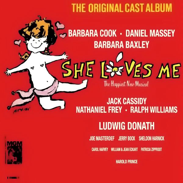
I actually quite like the OBC and first revival designs. And the 2011 concert artwork.


Keeping BroadwayWorld Illustrated
VintageSnarker
Broadway Legend Joined: 1/30/15
#21SHE LOVES ME revival design's (first) title treatment
Posted: 12/5/15 at 4:01pm
I think the rainbow design is quite lovely. And I didn't like the On the 20th Century design at all. Some of the ads in magazines looked much better.