Bronx Bombers Artwork
#2Bronx Bombers Artwork
Posted: 11/19/13 at 11:41amBWAHAHAHA!!!!!!!
"Pardon my prior Mcfee slip. I know how to spell her name. I just don't know how to type it." -Talulah
#3Bronx Bombers Artwork
Posted: 11/19/13 at 11:48amIt's giving me vertigo just looking at it. Why is everything slanted? I'm not even going to comment on the horrible cartoons.
"Pardon my prior Mcfee slip. I know how to spell her name. I just don't know how to type it." -Talulah
#4Bronx Bombers Artwork
Posted: 11/19/13 at 11:49amSo other than Yogi Berra and Babe Ruth, am I supposed to be able to identify the other players?
RW3
Broadway Legend Joined: 7/20/13


Smaxie
Broadway Legend Joined: 9/26/05
#7Bronx Bombers Artwork
Posted: 11/19/13 at 5:44pm
It reminded me of the following...

Begin at the beginning and go on till you come to the end: then stop.
#8Bronx Bombers Artwork
Posted: 11/19/13 at 6:18pm
"Why is everything slanted? "
I only noticed two slightly skewed lines on two of their neck contours. It's called caricature.
<-----I'M TOTES ROLLING MY EYES


Matt Rogers
Broadway Legend Joined: 10/4/04
#10Bronx Bombers Artwork
Posted: 11/19/13 at 7:16pmDid they try to saves few bucks and hire a college freshman to do their poster? Oh wait.......I've actually seen some college freshmen turn out good work, so they must have turned to junior high schoolers.
#11Bronx Bombers Artwork
Posted: 11/19/13 at 7:32pm
^ what's wrong with it? and how can you determine the age of the artist? Do you really think an artist who is out of high school couldn't do that work?
I don't get your post, please explain!
<-----I'M TOTES ROLLING MY EYES

Matt Rogers
Broadway Legend Joined: 10/4/04
#14Bronx Bombers Artwork
Posted: 11/19/13 at 8:26pmJane2, you really can't see that the characters are slanted and it looks like they're leaning backwards? Maybe you need a stronger prescription.
"Pardon my prior Mcfee slip. I know how to spell her name. I just don't know how to type it." -Talulah
#15Bronx Bombers Artwork
Posted: 11/19/13 at 8:55pm
^I don't know if you're trying to be snarky, but no, I just had my prescription adjusted thank you.
Anyway, back to the topic.Yes, it appears that the figures are a little warped. I don't know if that's due to the photography, or if the artwork was approved that way.
However, that's not what bothers me. Every time there's a thread about a new piece of theatrical art, the remarks are as primary school-ish as the artwork is blamed to be.
I can understand if the art doesn't appeal to you, and a legitimate reason is given, but I just read remarks like "atrocious, horrible, freshman in high school" etc.
I realize that having my BA and MA in art education and having taught art for 25 years on every level puts me at a different position but I wish people would try to give a more sensible reason for their hatred.
This is similar to all you folks who resent when someone says they didn't like a show, but give no meaningful reason for it. That's how I feel in these threads.
btw, the draughtsmanship is not bad in this piece. I can only guess those responsible for it have a reason for the distortion. If I knew the story of Bronx Bombers very well, maybe it would make sense to me.
<-----I'M TOTES ROLLING MY EYES
Matt Rogers
Broadway Legend Joined: 10/4/04
#16Bronx Bombers Artwork
Posted: 11/19/13 at 9:18pmJane, thanks for the detailed response and I appreciate where you are coming from but this particular art? Argghggghhhh. It almost looks like a cover for MAD Magazine, if that exists any more. It seems amateurish and aside from die hard Yankee fans, I don't know what demographic this is supposed to appeal to.
#17Bronx Bombers Artwork
Posted: 11/19/13 at 9:48pm
Well, as i said, I don't know what the show is about (besides the Yankees, lol) It doesn't seem like a great poster in any way, I have to admit.
It's not a cohesive design. The lettering, the chandelier, and the figures all seem to be from a different picture and thrown together. There's not enough space between the words and the people to have a chandelier look like it was planned. It looks like a last minute decision to me, and was stuck in there. And if I knew why the chandelier was there, I might know if the poster makes sense. I guess it signifies that the owners were wealthy? I'm out of the loop with this story.
Ok, I just took a closer look. I was hasty before when I said the drawing wasn't bad. It's not very good. I really don't get this whole thing.
Does anyone here know the storyline, and if this rendering reflects it?
Matt-good comment re Mad Magazine. Maybe it is that artist.
<-----I'M TOTES ROLLING MY EYES
FishermanBob
Broadway Legend Joined: 7/9/12
#18Bronx Bombers Artwork
Posted: 11/19/13 at 10:16pmJane - the chandelier I think, represents that a major part of the play takes place around a dinner table in a dining room. The use of caricatures was fairly widespread in the 1950's and 60's in the theater but the technology is light years ahead now so you almost never see it used anymore. It's such a lazy effort. They don't even look like who they are supposed to look like (with the exception of Yogi's exaggerated drawing). The one African American on the far right who is I assume supposed to be either Derek Jeter or Reggie Jackson actually looks more like Horace Clarke than either of them (long time Yankee fans will get the reference). Yankee Stadium itself is so iconic a structure, to not have used that somehow in the background is a real lost opportunity. It's just a lost opportunity on so many fronts. As a long time Yankee fan, it is no way, shape or form gets me excited about this production.
#19Bronx Bombers Artwork
Posted: 11/19/13 at 10:35pmThanks Bob-what is the woman holding up in her left hand? The picture is too small to see the details.
<-----I'M TOTES ROLLING MY EYES
FishermanBob
Broadway Legend Joined: 7/9/12
#20Bronx Bombers Artwork
Posted: 11/19/13 at 10:50pmLooks like a glass of champagne. Probably Cook's.
RippedMan
Broadway Legend Joined: 8/14/05
#22Bronx Bombers Artwork
Posted: 11/20/13 at 12:30amIt actually doesn't look awful up on the marquee, but those cartoons are terrible. It just dates the play, and not in a good way.
#23Bronx Bombers Artwork
Posted: 11/20/13 at 2:08am
Although I did not see Bronx Bombers, I know the play revolves around Yogi and his wife. That would explain him being the only clearly identifiable character. The player in the foreground is probably Babe Ruth based on his stirrups being pulled up higher than the others and his baggier pants but that's a guess. Yogi is looking at Babe with his hand on his heart and the other players seem to be looking in his direction too.
I agree with Jane that the chandelier should be cut out. It cramps up the scene too much . It is there only to signify what Bob said regarding the setting of the play. I like the color scheme of blue top and green below. Sky and grass colors.
Btw, "Lombardi", which was written by the same playwright, had a really nice image of just his face on the playbill. It's possible that permission to display realistic drawings of the more modern players in "Bronx Bombers" wasn't granted, perhaps a legal issue.
I'd really like to see "Bang the Drum Slowly" staged. It's my all-time favorite baseball movie.
Updated On: 11/20/13 at 02:08 AM

#24Bronx Bombers Artwork
Posted: 11/20/13 at 8:06pmWonder why she's dressed like Jackie Kennedy on Nov 22 1963
#25Bronx Bombers Artwork
Posted: 11/20/13 at 10:05pm
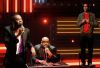
Babe Ruth is identifiable from the pose, which is derived from one of the most iconic photographs taken of him:

#26Bronx Bombers Artwork
Posted: 11/20/13 at 10:28pmhmm, looks like the artist found all the iconic photos he could of the Yankees and copied or traced them!
<-----I'M TOTES ROLLING MY EYES