Best show logos/artwork....
Emma White
Featured Actor Joined: 2/11/13
#25Best show logos/artwork....
Posted: 3/6/13 at 10:30pm
.jpg)
I'm also a fan of the Chicago logos with whoever the current Roxie is lying all over it.
"Nice is different than good."

Bobster
Swing Joined: 5/11/03


bobs3
Broadway Legend Joined: 4/8/12
#29Best show logos/artwork....
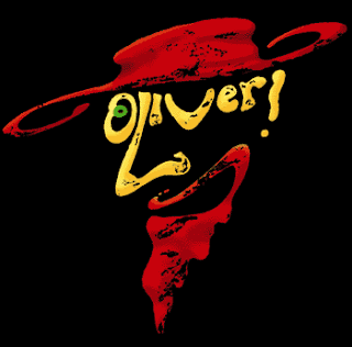
Posted: 4/25/13 at 7:23pmOliver! and My Fair Lady definitely look like the work of Dewynters but what about the others?
Jonwo
Broadway Legend Joined: 3/16/06
#30Best show logos/artwork....
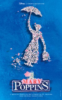
Posted: 4/25/13 at 7:50pmThat Poppins logo is Dewynters but it was changed about two years later, SITR is Dewynters as well.

#31Best show logos/artwork....
Posted: 4/25/13 at 9:22pmI loved the Dewynters' original Mary Poppins logo more than the current one. I'm also really liking the revival of Pippin, and the colours used on the recent Broadway revival of Porgy and Bess.
"Ok ok ok ok ok ok ok. Have you guys heard about fidget spinners!?" ~Patti LuPone
BWFan101
Understudy Joined: 9/15/12
#32Best show logos/artwork....
Posted: 4/25/13 at 9:40pmBat Boy the Musical
Common sense? What's common about it? No one has common sense. It should be called rare sense.
xoffender45
Broadway Star Joined: 8/12/07
#33Best show logos/artwork....
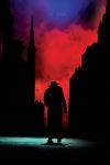
Posted: 4/25/13 at 10:37pm
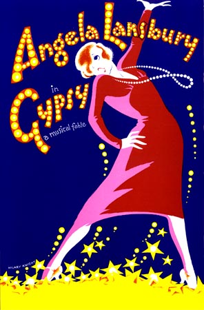
This is my absolute favorite. It hangs over my bed.
#34Best show logos/artwork....
Posted: 4/25/13 at 11:10pm
The PHANTOM logo may be iconic, but it's also incorrect. The Phantom does not wear that mask at any point, and it always bothers me to no end.
Words don't deserve that kind of malarkey. They're innocent, neutral, precise, standing for this, describing that, meaning the other, so if you look after them you can build bridges across incomprehension and chaos. But when they get their corners knocked off, they're no good anymore…I don't think writers are sacred, but words are. They deserve respect. If you get the right ones in the right order, you can nudge the world a little.
bobs3
Broadway Legend Joined: 4/8/12
