.png)
BRAND NEW! LES MIZ film poster, US Release
jacobsnchz14
Broadway Legend Joined: 12/13/06


#2BRAND NEW! LES MIZ film poster, US Release
Posted: 9/24/12 at 12:18pmIs this another horror movie with one of those evil demonic children?

#3BRAND NEW! LES MIZ film poster, US Release
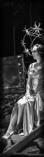
Posted: 9/24/12 at 12:26pmthis is absolutely stunning. What a genius, simple idea to translate the iconic broadway poster into an actual photograph. The more I see of this film, the more I'm certain I will love it.
#4BRAND NEW! LES MIZ film poster, US Release
Posted: 9/24/12 at 12:27pmI'm seconding CATSNYrevival, I'm sorry. You might as well just use the iconic logo if you're going to refer to it. If the girl weren't directed to stare at the camera as though she were on the verge of homicide and looked more forlorn, I might see this idea working, but it doesn't.
Formerly gvendo2005
Broadway Legend
joined: 5/1/05
Blocked: After Eight, suestorm, david_fick, emlodik, lovebwy, Dave28282, joevitus, BorisTomashevsky
Broadway Legend
joined: 5/1/05
Blocked: After Eight, suestorm, david_fick, emlodik, lovebwy, Dave28282, joevitus, BorisTomashevsky
Fan2
Broadway Legend Joined: 5/7/04
#5BRAND NEW! LES MIZ film poster, US Release
Posted: 9/24/12 at 12:32pm
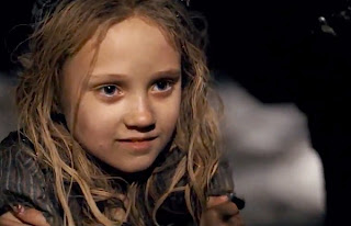
The little girl on the poster come to life! I'm sure we'll be getting posters of all the characters.
Here's Isabelle Allen, who plays young Cosette.


#7BRAND NEW! LES MIZ film poster, US Release
Posted: 9/24/12 at 12:34pmMy first thought was, "Creepy."
"...everyone finally shut up, and the audience could enjoy the beginning of the Anatevka Pogram in peace."
willep
Broadway Legend Joined: 9/20/08
Fan2
Broadway Legend Joined: 5/7/04
#9BRAND NEW! LES MIZ film poster, US Release
Posted: 9/24/12 at 12:34pmIt's now also the cover photo on the official Facebook page and on official Twitter, replacing the drawing.
#10BRAND NEW! LES MIZ film poster, US Release
Posted: 9/24/12 at 12:37pmChildren of the Corn X: Do You Hear the People Scream?
"...everyone finally shut up, and the audience could enjoy the beginning of the Anatevka Pogram in peace."
jo
Broadway Legend Joined: 5/15/03
#11BRAND NEW! LES MIZ film poster, US Release
Posted: 9/24/12 at 12:51pm
Very poignant image! After all, she is the symbol of the oppressed, the marginalized, les miserables!
What fame awaits Isabelle Allen!


#13BRAND NEW! LES MIZ film poster, US Release
Posted: 9/24/12 at 12:57pmMe too. I'm in the "love it" camp.
....but the world goes 'round

#14BRAND NEW! LES MIZ film poster, US Release
Posted: 9/24/12 at 1:00pmI love it.
"There’s nothing quite like the power and the passion of Broadway music. "
silversurfer2
Broadway Star Joined: 7/20/07
#15BRAND NEW! LES MIZ film poster, US Release
Posted: 9/24/12 at 1:06pmI am in the "Dislike it" camp. Why not stick with the Iconic Image that is so well known?

WiCkEDrOcKS
Broadway Legend Joined: 6/13/04
#16BRAND NEW! LES MIZ film poster, US Release
Posted: 9/24/12 at 1:10pm

Ehhh...
Updated On: 9/24/12 at 01:10 PM

JP2
Broadway Legend Joined: 6/2/07
#17BRAND NEW! LES MIZ film poster, US Release
Posted: 9/24/12 at 1:12pm
"I am in the "Dislike it" camp. Why not stick with the Iconic Image that is so well known?"
They did.. did you somehow miss the teaser poster?
Wildcard
Broadway Legend Joined: 6/21/06
#18BRAND NEW! LES MIZ film poster, US Release
Posted: 9/24/12 at 1:13pmI think it would have helped if she had that forlorn off-to-the-side look that the original illustration had. Having the bonnet (or whatever hat she is wearing in the original) would have helped make it feel more period as well. Finally, I'm not a fan of the fonts they used for the billing and the tag line. The idea behind the poster is good. It could have just been executed better.
#19BRAND NEW! LES MIZ film poster, US Release
Posted: 9/24/12 at 1:14pmYes, J.P., but that's the teaser poster, not the actual "let's-market-this-shiz" poster. And the actual "let's-market-this-shiz" poster looks like a Nazi sequel to The Grudge.
Formerly gvendo2005
Broadway Legend
joined: 5/1/05
Blocked: After Eight, suestorm, david_fick, emlodik, lovebwy, Dave28282, joevitus, BorisTomashevsky
Broadway Legend
joined: 5/1/05
Blocked: After Eight, suestorm, david_fick, emlodik, lovebwy, Dave28282, joevitus, BorisTomashevsky
JP2
Broadway Legend Joined: 6/2/07
#20BRAND NEW! LES MIZ film poster, US Release
Posted: 9/24/12 at 1:17pmA teaser poster and a theatrical one sheet are both still marketing material...
#21BRAND NEW! LES MIZ film poster, US Release
Posted: 9/24/12 at 1:27pm
Yes, because the general populace will be able to selectively ignore the theatrical one sheet for the teaser poster. *eyeroll* It looks like Children of the Damned with cleaner hair. It's not an inducement to anyone unfamiliar with the show to see it.
On an unrelated note, I hate the bloody tagline, too. "The dream lives on this Christmas"?! I know they want to remind people of that song, but that's an awful tagline for a film in which, presumably, nearly everybody has died by the end.
Formerly gvendo2005
Broadway Legend
joined: 5/1/05
Blocked: After Eight, suestorm, david_fick, emlodik, lovebwy, Dave28282, joevitus, BorisTomashevsky
Broadway Legend
joined: 5/1/05
Blocked: After Eight, suestorm, david_fick, emlodik, lovebwy, Dave28282, joevitus, BorisTomashevsky

#22BRAND NEW! LES MIZ film poster, US Release
Posted: 9/24/12 at 1:31pmThey are basically using the iconic logo- they just brought it to life- I think it's fantastic
#23BRAND NEW! LES MIZ film poster, US Release
Posted: 9/24/12 at 1:33pmLook at her. JUST LOOK AT THOSE EYES. She is about to f**kin' kill somebody. You don't see sadness, fear, loneliness, nothing forlorn about it. She's got the eyes of a mad dog. Yes, it's iconic, as the wanted poster in a Harry Potter picture. Switch back to the actual logo, guys.
Formerly gvendo2005
Broadway Legend
joined: 5/1/05
Blocked: After Eight, suestorm, david_fick, emlodik, lovebwy, Dave28282, joevitus, BorisTomashevsky
Broadway Legend
joined: 5/1/05
Blocked: After Eight, suestorm, david_fick, emlodik, lovebwy, Dave28282, joevitus, BorisTomashevsky
#24BRAND NEW! LES MIZ film poster, US Release
Posted: 9/24/12 at 1:34pm
I agree, castlestreet.
It's funny how it's such a Rorschach: some see poignant, some see creepy. Her expression looks completely neutral to me.
I love the way it evokes the logo without reproducing it exactly. It actually took me a sec to get it; then I was delighted.