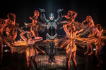
LEAP OF FAITH artwork
iluvtheatertrash
Broadway Legend Joined: 11/9/04
#1LEAP OF FAITH artwork
Posted: 1/27/12 at 11:11am
https://www.broadwayworld.com/article/LEAP-OF-FAITH-Broadway-Artwork-Revealed-20120127
That's it? Really?
"I know now that theatre saved my life." - Susan Stroman
jacobsnchz14
Broadway Legend Joined: 12/13/06
#2LEAP OF FAITH artwork
Posted: 1/27/12 at 11:22amI think the logo artwork might look better with a promotional image of Raul, or the cast or something. Alone, it looks too plain but better than the original from their pre-Broadway run.
#2LEAP OF FAITH artwork
Posted: 1/27/12 at 11:23amREALLY????? How much did they pay for that??? Whatever it was it was wayyy too much.
PlayItAgain
Broadway Legend Joined: 11/8/11
#4LEAP OF FAITH artwork
Posted: 1/27/12 at 12:21pmIn an effort to be positive about the artwork, all I can find to say is at least it's not orange!
Sarcasm is an allergic reaction to stupid people.
evic
Broadway Star Joined: 3/5/04
#5LEAP OF FAITH artwork
Posted: 1/27/12 at 12:42pm"Groundbreaking", "Original", "Creative" "Has To Be Seen To Be Believed", "Dazzling", "I Was Brought To Tears"....jus bein silly....Did one of the producer's children do it? More bad artwork on the St. James marquee.
BrodyFosse123
Broadway Legend Joined: 2/27/06
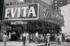
#6LEAP OF FAITH artwork
Posted: 1/27/12 at 12:48pm
If you think the logo is bland, checkout the show's official website:
http://www.leapoffaithbroadway.com/
egghumor
Broadway Legend Joined: 3/9/11
#7LEAP OF FAITH artwork
Posted: 1/27/12 at 12:55pmOy vey, brody123, you're not kidding. The production team needs to take a big leap of faith with a decent designer. The website barely looks like a homemade draft.
#8LEAP OF FAITH artwork
Posted: 1/27/12 at 12:57pmI like the artwork. It symbolizes the story in a subtle way. The website, a little too subtle, to say the least!
<-----I'M TOTES ROLLING MY EYES
#10LEAP OF FAITH artwork
Posted: 1/27/12 at 1:28pmWell, the artwork is certainly... tasteful. But I can't even say that about the website. Maybe they're revamping it now that they have artwork?
PlayItAgain
Broadway Legend Joined: 11/8/11
#11LEAP OF FAITH artwork
Posted: 1/27/12 at 1:31pmwell if this is a sign of things to come get ready for a half finished show....
#12LEAP OF FAITH artwork
Posted: 1/27/12 at 1:40pmI'm wondering why anyone thinks the show won't be any good because they don't like the artwork.
<-----I'M TOTES ROLLING MY EYES
jacobsnchz14
Broadway Legend Joined: 12/13/06
#13LEAP OF FAITH artwork
Posted: 1/27/12 at 2:17pmThat website looks like they're reviving the 2006 revival of COMPANY and calling it, LEAP OF FAITH.

WiCkEDrOcKS
Broadway Legend Joined: 6/13/04

#15LEAP OF FAITH artwork
Posted: 1/27/12 at 2:24pmI am in shock over the website. I could code the same website. I'm self taught and haven't coded anything in years.
"I never had theatre producers run after me. Some people want to make more Broadway shows out of movies. But Elliot and I aren't going to do Batman: The Musical." - Julie Taymor 1999
Ed_Mottershead
Broadway Legend Joined: 10/20/05
#16LEAP OF FAITH artwork
Posted: 1/27/12 at 2:43pmI love Raul Esparza and think he's one of the great talents of today's theatre. That being said, I doubt that his name alone is going to send the out-of-towners rushing to their phones to get tickets. It's got to be something more provocative -- and colorful. The way it looks now, you'd think it was some ponderous drama.
BroadwayEd
#17LEAP OF FAITH artwork
Posted: 1/27/12 at 2:49pm
Dear Leap of Faith producers,
You need double the artwork and half the fonts. How does this symbolize anything? "Mirror Ball" says Studio 54 at best and Sarah Maclachlan at least. It's been over 10 years since I've seen the movie, but the only sparkly bit I remember were the sequins. Mirror balls are not sequins. Also, what's with all the different typography?
Call me.
www.listenterprises.com
"Are we being attacked or entertained?" - MST3K
My theatre poster/logo portfolio: http://www.listenterprises.com/
theatreguy
Broadway Legend Joined: 7/31/03
#18LEAP OF FAITH artwork
Posted: 1/27/12 at 2:50pmI would be very surprised if this isn't just a placeholder so they can have something to put out there.
#19LEAP OF FAITH artwork
Posted: 1/27/12 at 2:53pmI would hope that isn't the final artwork, since it is quite bland. To be fair I highly highly doubt that website is anywhere near finished.
#20LEAP OF FAITH artwork
Posted: 1/27/12 at 2:59pm
"Mirror Ball" says Studio 54 at best and Sarah Maclachlan at least. It's been over 10 years since I've seen the movie, but the only sparkly bit I remember were the sequins. "
It's interesting how people see things differently. Rather than think about a disco ball, I saw it as "surface glitz" and "phony" which is what Nightengale was.
<-----I'M TOTES ROLLING MY EYES
#21LEAP OF FAITH artwork
Posted: 1/27/12 at 3:03pmLooks like word art
"There’s nothing quite like the power and the passion of Broadway music. "
#22LEAP OF FAITH artwork
Posted: 1/27/12 at 3:33pmReally, is it any worse than the Jesus Christ Superstar non-artwork? Advertising is dreadful recently. The Stickfly ad is horrible and I would bet does more to push people away than bring them in. One A Clear Day... made the musical look like a concert and then, with the addition of Ms. Mueller, like a bad high school art project. Lysistrata Jones was cute but made the show look like a high school production. What is going on?
#23LEAP OF FAITH artwork
Posted: 1/27/12 at 3:37pmI loved the logos for Rebeca and Bonnie and Clyde.
"There’s nothing quite like the power and the passion of Broadway music. "
#24LEAP OF FAITH artwork
Posted: 1/27/12 at 3:37pm
In all fairness, the jacket they used in the LA production was made of largish square mirrors that look far more like a disco ball than sequins. But the jacket is three-dimensional. It doesn't translate to flat art.
And what on earth is anyone going to get about the show from that artwork? Honestly, the more I looked at the font for Raul's name, the more it reminded me of Superman. Now, I love Raul to death, but "man of steel", really?
The whole thing just looks....dreary, along with what most everyone else said here so far.
Sarcasm is an allergic reaction to stupid people.
Updated On: 1/27/12 at 03:37 PM