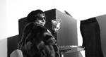
New Sister Act Broadway artwork
#1New Sister Act Broadway artwork
Posted: 10/20/11 at 1:50pm
Thoughts?


''With the number of people I ignore, I'm lucky I work at all in this town'' - Helena Bonham Carter

#2New Sister Act Broadway artwork
Posted: 10/20/11 at 1:58pmLove it! So much better than the graffiti look.

#2New Sister Act Broadway artwork
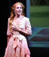
Posted: 10/20/11 at 2:04pmSecond one looks better with the logo blending in with the cast and scenery.
Everything in life...is only for now.

#3New Sister Act Broadway artwork
Posted: 10/20/11 at 2:44pmAhh, Photoshop. Pounding another nail into the coffin of good design and typography.
Cheyenne Jackson tickled me. AFTER ordering SoMMS a drink but NOT tickling him, and hanging out with Girly in his dressing room (where he DIDN'T tickle her) but BEFORE we got married. To others. And then he tweeted Boobs. He also tweeted he's good friends with some chick on "The Voice" who just happens to be good friends with Tink's ex. And I'm still married. Oh, and this just in: "Pettiness, spite, malice ....Such ugly emotions... So sad." - After Eight, talking about MEEEEEEEE!!! I'm so honored! :-)
#4New Sister Act Broadway artwork
Posted: 10/20/11 at 3:37pm
The second one certainly addresses one of the reasons the first logo was claimed to fail by Michael Riedel - that people didn't know the show was a spectacle etc..
I like it. It makes the show look so much fun.
"You can't overrate Bernadette Peters. She is such a genius. There's a moment in "Too Many Mornings" and Bernadette doing 'I wore green the last time' - It's a voice that is just already given up - it is so sorrowful. Tragic. You can see from that moment the show is going to be headed into such dark territory and it hinges on this tiny throwaway moment of the voice." - Ben Brantley (2022)
"Bernadette's whole, stunning performance [as Rose in Gypsy] galvanized the actors capable of letting loose with her. Bernadette's Rose did take its rightful place, but too late, and unseen by too many who should have seen it" Arthur Laurents (2009)
"Sondheim's own favorite star performances? [Bernadette] Peters in ''Sunday in the Park,'' Lansbury in ''Sweeney Todd'' and ''obviously, Ethel was thrilling in 'Gypsy.'' Nytimes, 2000
Updated On: 10/20/11 at 03:37 PM


#6New Sister Act Broadway artwork
Posted: 10/20/11 at 3:57pmthe cast looks so pale that they remind me of the Voca People.
RippedMan
Broadway Legend Joined: 8/14/05
#7New Sister Act Broadway artwork
Posted: 10/20/11 at 5:47pmMy guess is that originally they thought Sister Act would be a star vehicle for Patina Miller, but when she lots out to Sutton they had to revamp the logo because no one really knows who Patina is.

#8New Sister Act Broadway artwork
Posted: 10/20/11 at 7:14pmI don't really like the font that they chose, but I like the rest of it. The font is just very simple, but I'm guessing they were looking for something closer to the movie logo.
bwayfan7000
Broadway Legend Joined: 3/28/09
#10New Sister Act Broadway artwork
Posted: 10/20/11 at 7:27pmI think I like it...but I'm not sure. I should love the second one, but the picture looks too...candid? I don't really know how to describe what I think of it, but it's not awful. I would just like them to make artwork that makes the show sell, because the show I like, no matter how I feel about the artwork.
"Art, in itself, is an attempt to bring order out of chaos."-Stephen Sondheim

#11New Sister Act Broadway artwork
Posted: 10/20/11 at 8:09pmA great example of polishing a turd. Why spend the $$$ on new logos when the show will be gone in 3 months? What a waste.
"The sexual energy between the mother and son really concerns me!"-random woman behind me at Next to Normal
"I want to meet him after and bang him!"-random woman who exposed her breasts at Rock of Ages, referring to James Carpinello
#12New Sister Act Broadway artwork
Posted: 10/20/11 at 8:46pmLol sad. But why should the producers, who will lose millions if this closes shortly, give up?
"You can't overrate Bernadette Peters. She is such a genius. There's a moment in "Too Many Mornings" and Bernadette doing 'I wore green the last time' - It's a voice that is just already given up - it is so sorrowful. Tragic. You can see from that moment the show is going to be headed into such dark territory and it hinges on this tiny throwaway moment of the voice." - Ben Brantley (2022)
"Bernadette's whole, stunning performance [as Rose in Gypsy] galvanized the actors capable of letting loose with her. Bernadette's Rose did take its rightful place, but too late, and unseen by too many who should have seen it" Arthur Laurents (2009)
"Sondheim's own favorite star performances? [Bernadette] Peters in ''Sunday in the Park,'' Lansbury in ''Sweeney Todd'' and ''obviously, Ethel was thrilling in 'Gypsy.'' Nytimes, 2000
#13New Sister Act Broadway artwork
Posted: 10/20/11 at 8:54pm
I think it's a vast improvement over the last logo.
I like it.
#14New Sister Act Broadway artwork
Posted: 10/20/11 at 9:28pmI love it!!!
"There’s nothing quite like the power and the passion of Broadway music. "

hyperbole_and_a_half
Leading Actor Joined: 3/21/11
#15New Sister Act Broadway artwork
Posted: 10/20/11 at 9:41pmI don't know if it's the 3D or the shiny or what, but there is something nauseating about the kerning in the new logo :S
#16New Sister Act Broadway artwork
Posted: 10/20/11 at 9:53pmTo me. it's overstimulating. But then again, so is the musical. Like the previous comment, it definitely gives me a headache.
"The sexual energy between the mother and son really concerns me!"-random woman behind me at Next to Normal
"I want to meet him after and bang him!"-random woman who exposed her breasts at Rock of Ages, referring to James Carpinello

bwaylyric
Broadway Legend Joined: 10/22/03

#19New Sister Act Broadway artwork
Posted: 10/21/11 at 11:48amThe font looks the same as used in the poster for the film, as well as the same placement. Maybe they're trying to get people to recognize/remember it immediately.
husk_charmer
Broadway Legend Joined: 10/19/06
#20New Sister Act Broadway artwork
Posted: 10/21/11 at 12:50pm
Hyperbole_and_a_half-
Agreed. I think the kerning is so weird because of the 3D...I particularly hate it on the 'ER' and 'CT.'
http://www.youtube.com/huskcharmer

Stand-by Joined: 12/31/69
#23New Sister Act Broadway artwork
Posted: 10/21/11 at 9:08pmIt's alright but is Gloriously Broadway their slogan? I get the thought behind it but I don't like it...
philly03
Broadway Legend Joined: 9/20/07
#24New Sister Act Broadway artwork
Posted: 10/21/11 at 9:13pm
![]()
I always liked the "original" logo from a few years ago, I'm sure they have different companies but I wonder why they didn't go back to the concept of this.